Tech
Google Gemini’s first UI redesign has arrived on Android

Key Takeaways
- The Google Gemini app for Android now has a cleaner, less cluttered interface.
- The carousel of suggested prompts is gone, and the microphone and camera buttons have been combined.
- The updated app is rolling out for all Gemini users on Android only, with no mention yet of an iOS app update.
The Google Gemini app isn’t even a year old, and it has already undergone a complete facelift. Now the app’s homescreen is less cluttered and more streamlined, making it more intuitive to use and fitting in better with Google’s design ethos. It looks great on Pixel.
Related
Google Gemini: Everything you need to know about Google’s next-gen multimodal AI
Google Gemini is here, with a whole new approach to multimodal AI
The first thing you’ll notice is the removal of the suggestions carousel that was along the top of the screen (via 9to5Google). The ‘Chats & Gems’ section is also gone. Both have been replaced by a full-screen blank slate with a personal greeting. A discreet chat bubble icon will let you pull up your chat history.
It looks less cluttered and more intuitive
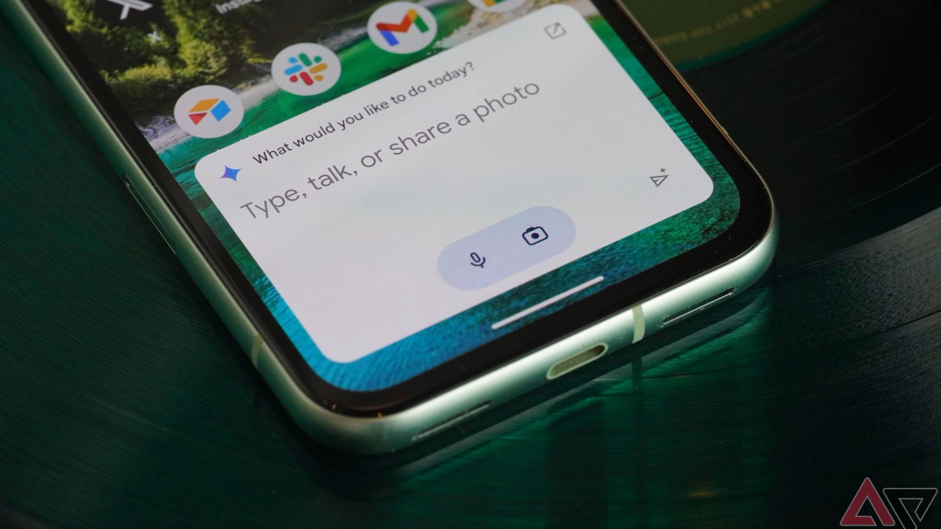
The bottom of the screen also received a refresh. Gone is the lengthy prompt, the microphone button, and the camera button. They’ve all been replaced with a single line that reads “Type, talk, or share a photo to Gemini.” The microphone and camera button are now combined, and there’s a Gemini Live waveform button.
The design is a replica of the Gemini web app, which has a much more minimalist interface. The design choices here look great. Unnecesssary elements have been removed, because let’s face it, hardly anyone used those suggested prompts that were in the carousel along the top. The redesign is much friendlier on the eyes now that those are gone.
It’s a lot like the clean Google Search page
Google may be focusing on making Gemini easier to use for those new to AI chatbots. OpenAI’s ChatGPT and Microsoft CoPilot can both be intimidating the first time someone sees them. Gemini’s new look is much more approachable.
In fact, this UI refresh looks and feels more like the Google search page. It is clean, with lots of white space and one large box for entering text. Anyone familiar with Google will instantly understand how to use Gemini. Previous updates focused on enhancing Gemini’s capabilities, so it’s nice to see Google work on the UI this time around.
The update is currently rolling out to both free and paid Gemini users on Android. It’s not currently available on the iOS app, and there’s no word of when, or if, it will come.

:quality(70):focal(958x822:968x832)/cloudfront-us-east-1.images.arcpublishing.com/shawmedia/JAEFIIKPTVFAPKJ55WWVVO7HAY.jpg)


