Tech
OnePlus OxygenOS 15 hands-on review
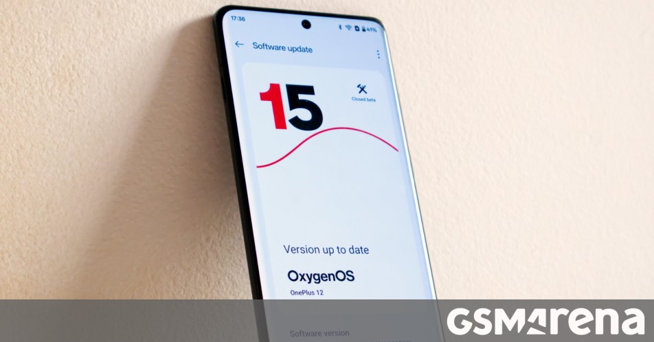
OxygenOS 15 is the next major interaction in the software used by OnePlus devices. Based on the latest Android 15, OxygenOS 15 brings with it several new UI changes along with a smattering of AI features that have now become prerequisite as well as some new security and multitasking enhancements.
We have been using the closed beta of the OS running on a OnePlus 12. This version will be released as an open beta later this month and should be similar to the final build arriving later this year. Let’s see what OnePlus has in store for us this year.
Design
One of the major points of focus for the new OxygenOS 15 update is the updated design. While this is by no means a complete redesign, OnePlus has made several changes across the board while also fundamentally changing how things work under the hood to make those visuals happen.
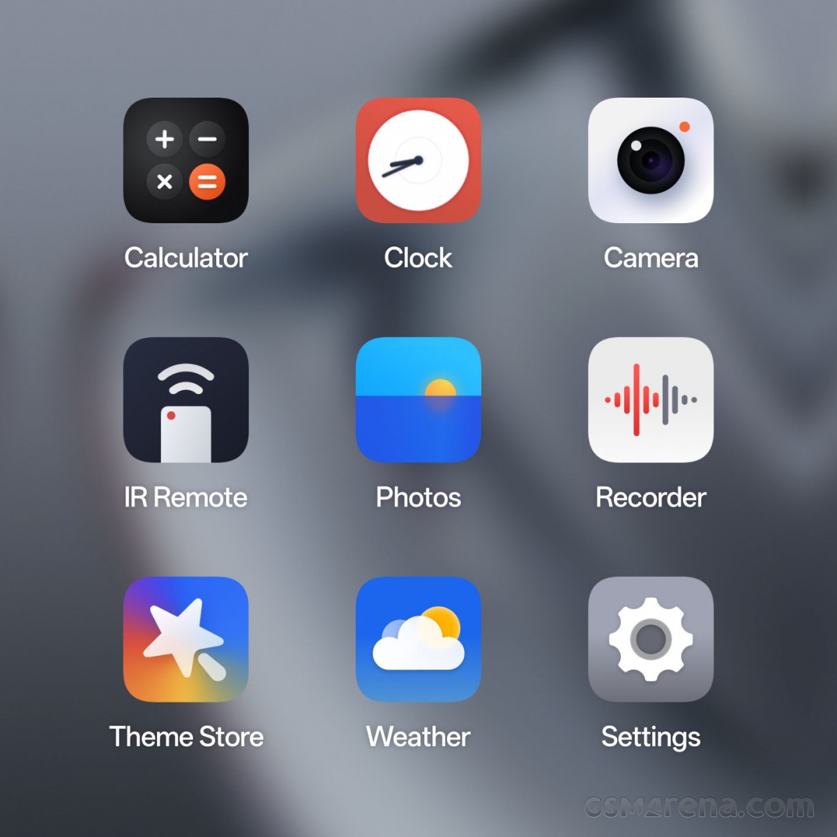
Let’s start with some of the more obvious changes first. There are now new icons for all the first-party apps, including the Calculator, Clock, Photos, Settings, Recorder, and Weather. However, the apps are still static and not animated, as on some of the competing devices. The apps also do not have different colors for light and dark mode, which feels like a missed opportunity.
You can still customize the app icons and now there are two more themes — Radiance and Shadow — that you can switch to, along with any custom icon packs you have installed. On OxygenOS, square is still the default shape of the icons with no default circular option like on ColorOS.
The notifications and quick settings page has also received some attention. For one, you can now have the two split into two separate pages, much like on iOS and some of the other Android brands. However, that is merely an option and you can continue to have the two on the same page as before, which is nice for those who don’t like major changes forced on to them.


Notifications and quick settings
The design of the toggles has changed with more circular shapes for the sliders. However, you can change their shape in the settings to make them back to the way they were in OxygenOS 14.
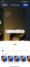
For those asking for more home and lockscreen customization, OxygenOS 15 offers a lot more options. Starting with the homescreen, you can apply a style filter to the wallpaper, which produces a Nothing OS-like refracted glass effect, except with a lot more options. You can also add a blur filter to your wallpaper OnePlus has also added a lot more default still wallpapers, along with some new HDR live wallpapers.


Lockscreen and always-on display customization
For the lockscreen, you have the same options for the wallpaper as the homescreen. Additionally, you can customize the clock that you see with a very iOS-style menu, complete with clock fonts, sizes, and colors. Also like iOS, the lockscreen can recognize objects, animals, and people in the frame and apply a depth filter so that the object in the frame can overlap the lockscreen elements. Finally, you can also customize the always-on display screen by picking the one that came with your theme or one of the default options.
Aside from these major changes, there are also several minor ones peppered throughout. OnePlus has altered the weight of the default fonts, especially One Sans, which is now bolder in many places. By the way, we have chosen to use One Sans in these screenshots as it just looks nicer but the default font is still Roboto.


New font rendering and advanced visual effects
There is an advanced visual effects option in the settings, which claims to apply blur effects to the background of notifications, quick settings, and home screen folders. However, on the OnePlus 12 running the beta, this option just seemed permanently on and switching it off did nothing. This seems like an option more suitable to more budget devices where it may be set to off by default to save on performance but then you can optionally enable it to turn on some eye candy. Xiaomi has had a similar option on some of its phones.
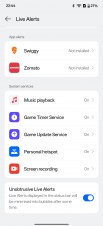
The Smart suggestions feature, which previously showed real-time notifications for supported cab hailing and food delivery apps has been altered so now instead of showing a standard Android notification, it turns the area around the front camera into a fake iOS-style dynamic island. You can tap that area to open the notification in the app or in a floating card. The feature has been renamed to Live Alerts and now also supports things like music playback, timers, hotspot, screen recording, and more.


Charging and fingerprint animation
There is now a new charging animation that plays when you plug the phone in. The animation varies based on what charger you use and is more vibrant for faster chargers. There is also a new animation for the fingerprint unlock called Halo, which looks a bit similar to the charging animation.
Getting back to the first party apps, one of the disappointing things about this update is that almost all of them look exactly the same as they did before. There are a few differences, such as the Calculator app gaining a number system converter, the Camera app getting a few items rearranged in the settings, and the Photos app gaining some AI features (more on that later) but aside from that they are unchanged.
The only exception to this is the Settings app, which features new iconography, rounded corners on some elements, and certain menus being rearranged. The Settings app also shows off the new color theme called Two-tone, which gets rid of most of the colors and makes the entire app essentially monochrome.
Animations
OnePlus has overhauled the way animations are handled in OxygenOS 15. The previous version had animations for things like app launches, multi-tasking, etc. being handled serially, wherein the entire animation was intended to play out before the next would begin in a serial order. If the user were to interrupt such animation, it had to be abruptly ended before a second animation could be triggered. This resulted in a visual stutter as well as a minor delay before the next action could be performed.
With OxygenOS 15, OnePlus is introducing parallel processing, which it claims is an industry-first for this scenario. The animations can now be run parallel to each other, which means a user could trigger a second animation while the first is still being performed and the OS would transition gracefully as it no longer has to end one before starting the next as they can run parallel to each other. This results in less visible animation stutters and a more responsive interface. OnePlus has also altered many of the animations so they play out a bit differently than before.
In side by side comparisons, it was difficult to notice the improvement OnePlus was promising with this update. The change in some of the animations also made it difficult to ascertain if the changes were due to the parallel processing or simply a different animation. While there’s no denying that the underlying technology is superior, it doesn’t manifest itself in a way most users would readily notice. Rather, this seems like something that you may pick up on subconsciously over time, especially if you use OxygenOS 15 for a while and then switch back to 14.
The way OnePlus demonstrated this technology to us was also telling of the fact that it wasn’t something you’d notice in just everyday use. The company showed side by side videos of a OnePlus 12 running OxygenOS 14 and OxygenOS 15 and the user opening multiple apps in slow motion. It reminded us of those pointless videos on YouTube, where people open apps rapidly on two phones side by side as if it proves something. In reality, those videos have always been useless because no one uses their phones this way and it’s a bit unfortunate that OnePlus had to resort to that to show their phones are superior to the competition.
But as nuanced as this aspect of the OxygenOS 15 is, it is commendable that OnePlus is choosing to invest time and resources in it anyway. If anything, it shows a commitment to chasing the last mile when it comes to optimizing the performance of the UI and animations to attain the smoothest possible experience, even if it may not be immediately obvious in everyday usage.
AI
While previous versions of OxygenOS included some AI features, the company has expanded that to a much broader portfolio that covers a lot more functions of the device.
Starting with the Photos app, many of the previous AI features have been upgraded and collated in a separate AI Editor option. Here, you have four options, AI Detail Boost, AI Eraser, AI Unblur, and AI Reflection Eraser.


AI Detail Boost: Original vs Edited
The AI Detail Boost is a cloud-based option that sends your low resolution images to the server and produces a sharper, more detailed image. In practice, it did look reasonably sharper with slightly better detail, more than you’d get with a simple sharpening filter. There is some garbling of texture that makes it clear it was AI enhanced but it’s only noticeable if you look closely. Overall, this feature is decent for those aggressively cropped or digitally zoomed in shots.
The AI Eraser was hit and miss. The Smart Lasso feature rarely produced good results as the images often had obvious remnants of the things that were erased. Even when it did erase the object completely, the way it would fill in the blanks left noticeable blurred patches. The option to remove people would also fail to detect human subjects unless they were standing upright. However, this option did work better than Smart lasso or the Paint over options, with some decent results at times. The AI Eraser processing is done locally, and is perhaps the reason why it’s not especially good.
Next is AI Unblur, which like Detail Boost also sends your images to the cloud. This option is designed to remove the motion blur for when the camera moves and creates a mess. Based on how bad the blur is, this mode produced some surprisingly usable results. It is important to note however that it is optimized to work on images where the blur is caused by the camera moving, not the subject, so you won’t get good results with the latter.
Finally, there is the AI Reflection Eraser. This was always going to be a tricky one and in the images we tried, it really did not work well at all. This option is also cloud-based.
Moving away from the Photos app, there’s also a new Intelligent Search feature, which uses on-device as well as the cloud to find information from across the apps on your device. You need to enter just your usual natural language query and the feature will help you find files that contain your query, even if it is phrased a bit differently. It can also provide you a summary for that query along with the files containing the answer. However, during our testing, this feature was not available.
Other AI features include Pass Scan (on-device), which scans your boarding passes through the camera or photo album and adds them to your Google Wallet. AI Notes (cloud) can format, clean-up, or polish your notes in the OnePlus Notes app. You can also use elaborate or shorten to increase or reduce the verbosity of the text, or change the writing style to casual or formal. AI Reply (cloud) can be used in messaging apps. It looks at the conversation you are having and generates various replies in different tones. And finally, there are some features based on Google services, such as Circle to Search and Gemini, the latter of which is now the default voice assistant on the phone.
Other features
Aside from the previous tentpole features, OxygenOS 15 also has a fair number of other assorted new features that are worth discussing.
For starters, OnePlus claims to have reduced the size of the operating system but it comes with a catch. OnePlus claims that OxygenOS 15 on the company’s next flagship (let’s just call it the OnePlus 13 for now) will be 20% smaller than OxygenOS 14 on the OnePlus 12. The catch is that this applies only to this and other upcoming devices, as there are no savings to be had for current devices. As a matter of fact, OxygenOS 15 took up an additional 4-5GB on our OnePlus 12 after installation. That’s not much but to go from “you’re not getting any size savings on your current device” to “actually we are going to take up even more space” isn’t very nice.
Next, OnePlus has brought over its Open Canvas feature from the OnePlus Open to candybar devices. You now have more freedom in how you split two apps on screen, and a new Shrink feature will collapse one of the apps to a small portion so you can focus on the other. As before, you can easily drag and drop content between the two open apps, as long as they are compatible. This makes split screen much more usable on candybar devices such as the OnePlus 12 as you can have two apps on screen but also have a decent experience in each without splitting both into unusable sizes.
OnePlus has also added a new Share with iPhone option, where OnePlus devices running OxygenOS 15 will be able to send files to an iOS device. You will need to install the O+Connect app on the iPhone or iPad and you will be good to go. For whatever reason, however, the option does now show up if you use the search function in the Settings app, and you have to go find it in the Connections & sharing menu.
There are also some new security features on top of what Android 15 already brings. A new theft protection system uses information from gyroscopes to detect sudden device acceleration to lock itself from thieves. The device is also locked if the phone remains offline or the SIM is removed. The phone will then require biometric unlock so even if someone manages to nab your passcode, the phone will require a fingerprint to be unlocked.
Saving the worst for the last is the new Phone Manager app. It lets you clean the storage on your device, checks your payment apps, and scans for viruses. We have seen apps like these over the years on other Chinese phones and it’s the sort of thing OnePlus has always avoided in the past. These apps, at best, are borderline useless and at worst, create paranoia among the users about non-existent threats of viruses or having to neurotically clean your device’s storage and memory. Old OnePlus would have never had an app like this but if you needed any more proof that the old OnePlus is gone, just take a look at this app.
As an aside, we also ran some benchmark passes on the latest OxygenOS 14 and our OxygenOS 15 beta build and saw no notable improvement or regression in performance.
Conclusion
OxygenOS 15 brings some notable visual changes to the platform. It’s fresher and sleeker than before and while not all of the performance improvements are impactful in everyday use, it’s nice to have them anyway. The AI features are an acquired taste and range from actually useful to gimmicky to borderline tacky (please don’t send your friends AI generated replies). But the new Open Canvas multitasking mode is nice, as are the new security features and the Send to iPhone option.
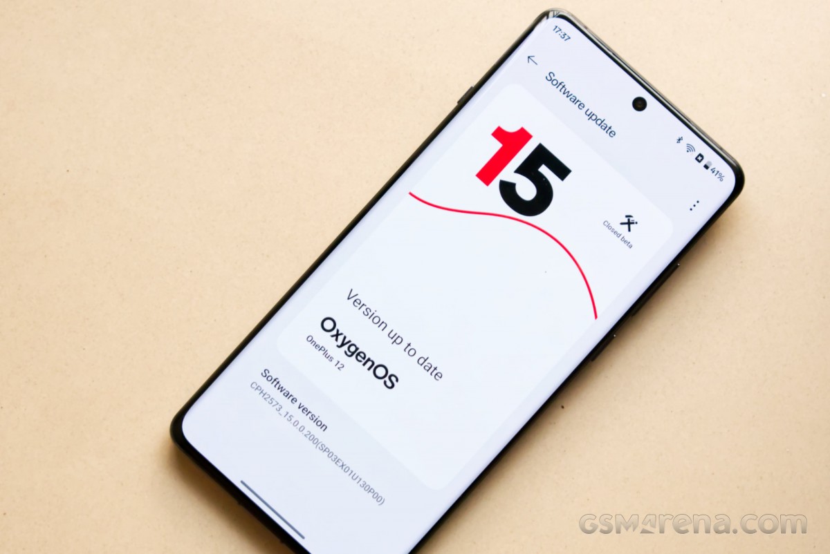
But it’s not all peaches and cream. There is a distinct lack of originality here, with an overwhelming number of UI elements and features borrowed heavily from iOS. The quick settings screen looks like iOS, the new lockscreen customization looks like iOS, and even the Live Alerts feature looks like the iPhone’s Dynamic Island. To see OxygenOS go from a cooler version of stock Android to a bootleg iOS has been a sobering experience.
Also, while we have been referring to it as OxygenOS, it is functionally identical to ColorOS in everything but the name. There are no exclusive features here nor any sort of unique identity. What exactly is ‘OnePlus’ about this, we are not sure. At this point, they may as well change the name so we can all stop pretending this imposter has anything in common with the original vision for OxygenOS.
If you are new to OnePlus, you probably don’t care about any of that. All you need to know is that the new update is decent and should make your phone look and feel a bit better once it starts rolling out later this year.


