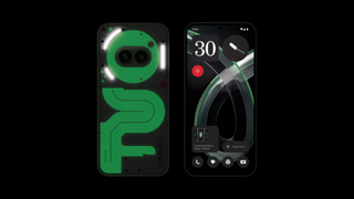
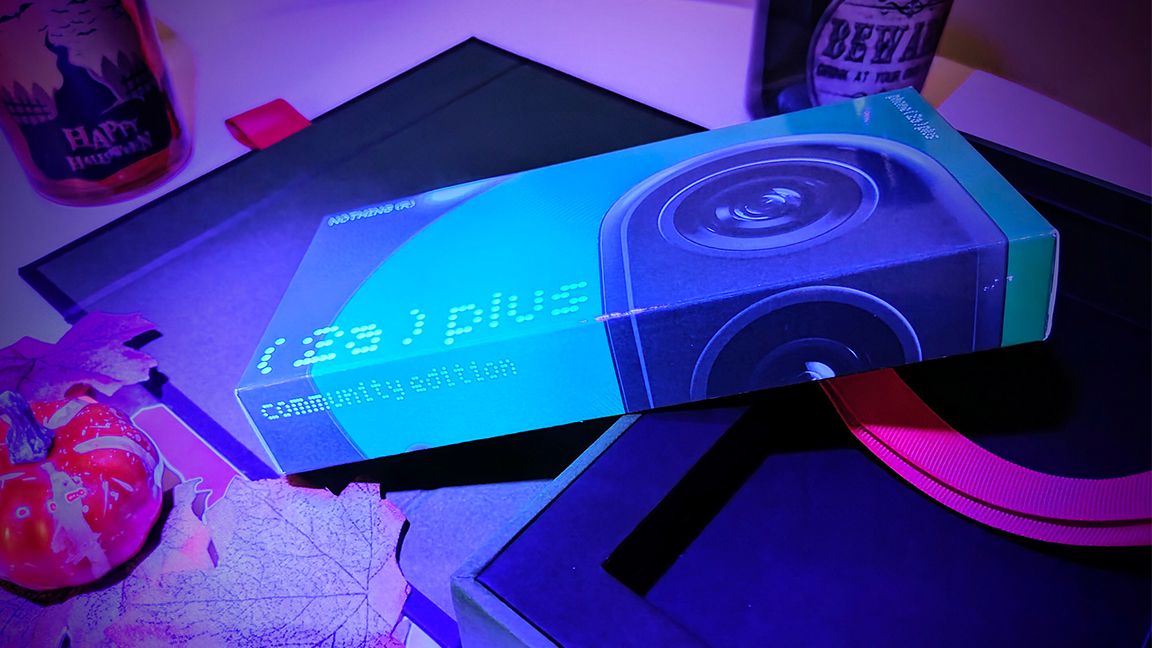
Nothing Phones are a little different, and the latest release is an industry first. The Phone (2a) Plus Community Edition is the first smartphone designed by the community. It’s also a glow-in-the-dark green slab of fun, that’s ideal for Halloween (I have an early release model, and it’s definitely unique). It’s taken six months and includes four winners across hardware, wallpaper, packaging and marketing design.
I’ve reviewed all of the Nothing phones, including the new Phone (2a) Plus, which is an iterative release and a very good budget-priced smartphone. But like all Nothing products, it’s the design that jumps out and the new Community Edition proudly taps into the talents of the brand’s own community for inspiration.
The Community Edition pushes the idea of phone design to a new level – while other brands are content with an annual colour refresh, by handing the design reins to its own community Nothing has taken the bold decision to let go, and frankly, anything is now possible.
The new Phone (2a) Plus Community Edition is a case in point, it’s a glow-in-the-dark design that is a perfect treat for Halloween. But it’s not simply a gimmick, the new green glowing design carries across every aspect of the design, from the hardware’s rear, winding panels to the wallpaper feature and even the box and branding – seen in a dark room secret Community Edition messaging becomes visible, a glowing green motif under UV lights.
With over 900 entries from 47 countries around the world, the Community Edition Project has been a success for the brand. It’s shown how branding, design and community engagement can work seamlessly together. Winners Astrid Vanhuyse and Kenta Akasaki, Andrés Mateos, Ian Henry Simmonds and Sonya Palma were invited to collaborate with Nothing’s London Design Studio on the final hardware, packaging, wallpaper and marketing. You can read more on the Nothing Community Edition Project website.
To learn a little more I caught up with Community Edition’s winning wallpaper designer Andrés Mateos, who mixed hand-drawn elements with digital design, AI generations, and post-editing to create a uniquely complex and layered final wallpaper design. Read my interview with Andres below.
Can you tell us a little about yourself; are you a designer, artist or aspiring creator?
Andrés Mateos: I work as an art director in advertising and also as freelance with startups and design studios on exciting projects. I’m a product design and tech lover, always exploring trends and seeking new challenges. I’m passionate about how creativity can transform ideas into tangible, meaningful experiences, and I enjoy collaborating with others to bring innovative concepts to life.
What inspired your design?
AM: The collection concept is inspired by the connections that build a community. It’s a fairly abstract exercise that aims to represent the pathways linking us to other places and people around the world. Transparency and retro electronic circuits were key sources of inspiration for my starting point, providing an aesthetic way to look inside the machines. Each design reflects a story or interaction, highlighting the importance of human connection in the digital world.
Image 1 of 2


Can you give us an overview of how you designed and created the wallpaper?
AM: Once the concept and look and feel of the collection were decided, I sketched several pathways that we transformed using AI tools into circuits with different styles. These served as the foundation for exploring the final form of each wallpaper.
In the recropping phase, we considered the interaction with the user interface, rearranging each element to find the balance between artistic and functional. This process allowed me to experiment with different combinations and styles.
Once the final composition was determined, we went through several stages of cleaning, manual retouching, and upscaling to individually correct each element and achieve the desired final results, ensuring that each wallpaper has its own voice within the collection.
Image 1 of 3


Should more tech brands open the door to their community like Nothing?
AM: Absolutely! In my opinion, the future of every tech brand is completely linked to its community. Some brands, like Nothing, are already realising that communities have a lot to say – and do.
The barriers separating brands from their communities are becoming increasingly smaller, presenting an opportunity to create synergies that help brands evolve into shared spaces. This approach not only humanises brands but also fosters loyalty and a sense of belonging, which is essential in such a competitive market.
I envision a future where brands actively collaborate with their users to create products and experiences that truly reflect their needs and desires.
What did you learn or get from the experience?
AM: I discovered that magic doesn’t exist and why Nothing is achieving so great results; all those good products are backed by a team of professionals who excel in their fields. Every part of the process has been incredibly enriching, teaching me that collaboration is key.
I also learned that originality and taking risks pay off; my proposal was risky, but fortunately, there are brands like Nothing that want to do things differently. This experience has inspired me to keep exploring unconventional ideas and continue learning from every project.

Daily design news, reviews, how-tos and more, as picked by the editors.


