Tech
One UI 7 is making me fall in love with Samsung all over again
Zac Kew-Denniss / Android Authority
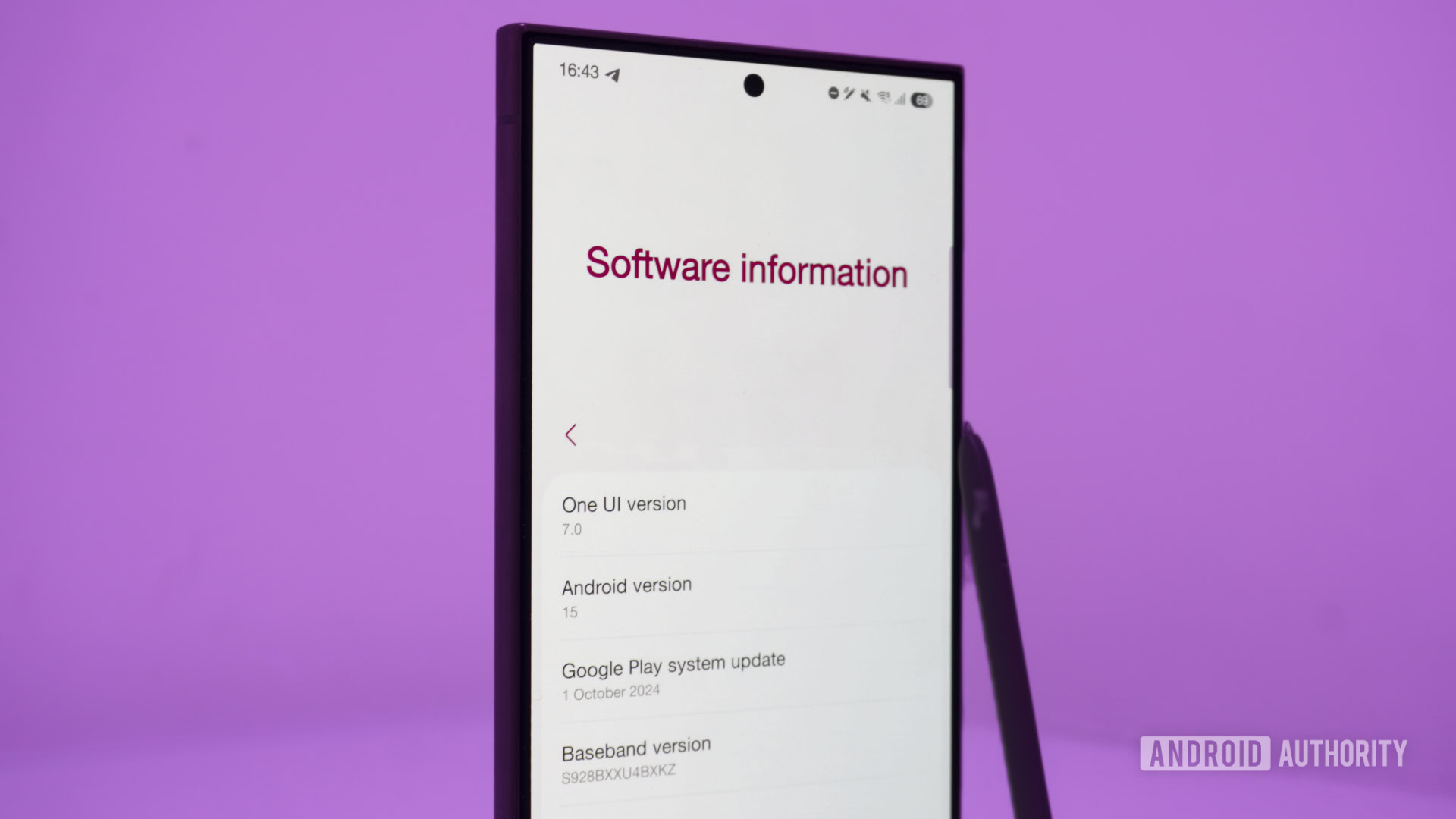
After months of leaks and delays, Samsung’s One UI 7 beta is finally available for the Galaxy S24 series. Those early leaks showed a controversial departure for Samsung, thanks to redesigned UI elements that looked uncomfortably similar to iOS. But now that I have One UI 7 on my Galaxy S24 Ultra, I can confidently say this is the most significant update since One UI first launched alongside the S10, and I love what I’ve seen so far.
The problematic stuff is all here, but a lot of it has been toned down compared to the leaked screenshots we saw over the last few months. And once you manage to look past any similarities with other operating systems, One UI 7 has a lot going for it.
Have you installed Samsung’s One UI 7 beta or not yet?
206 votes
The need for speed
Samsung’s One UI has always been quite smooth, but some animations, especially for opening and closing apps, have struggled with stuttering and frame drops. That’s all changed in One UI 7, which uses non-linear app animations that respond better to your finger movements and rival the Pixel or iPhone in terms of smoothness.
One UI 7 feels zippier even though it’s a beta. Opening apps and scrolling through lists feel more fluid than One UI 6 ever did, and all those minor improvements combine into something noticeable. This may be one of the most significant but underrated changes in this new version.
A vertical app drawer, finally!
This one is big. For years, enthusiasts have been begging Samsung to switch to a vertical app drawer instead of the paginated horizontal drawer Samsung phones have had. One UI 7 has finally done that, moving the search bar to the bottom and decluttering the app list overall. Plus, I believe Samsung’s new app drawer is superior to what Google offers on the Pixel because it remembers your position. If you open an app from the drawer, swipe to go home, and then open the drawer again, it will open in the last position you were in.
If you liked the old layout, and I know many people do, you can get it back by changing the sort order to custom instead of alphabetical. The issue is that while you’ll get the horizontal pages back, your apps will be in a random order and almost impossible to sort through. Hopefully, Samsung will address that in future builds.
Useful alarm groups
This feature may seem insignificant to some, but it’s one of my favorite additions to One UI 7. The clock app lets you group multiple alarms, making it easy to find alarms related to each other and turn them all on or off with one button. In the morning, I like to take my medication half an hour before I need to get up, so I have separate medication and wake-up alarms. Seeing them in one place and quickly turning them off together if I have a day off is a nice quality-of-life update.
The dreadful notifications and quick settings change
Just as Google is rumored to be doing with Android 16, Samsung has separated the notification shade from the quick settings panel, and the new layout works the same way as the control center on the iPhone. Swiping down from the left or middle of the screen displays your notification panel, which now lacks the brightness slider and toggles at the top. Swiping down from the right side, however, summons the quick settings panel, which has had an overhaul of its own. The section containing customizable toggles only shows two rows of controls, hiding the rest in a vertical list when you swipe down on them.
The brightness slider shares space with a volume slider, and next to these are sound profile and dark mode buttons. On One UI 6, the brightness slider had a three-dot menu that housed the toggles for auto-brightness, adaptive color tone, and extra brightness. With the new layout, you long-press the brightness slider to access these controls. Long-pressing the volume slider when Galaxy Buds 3 or 3 Pro are connected will give you options for transparency mode and noise canceling.
I really hate the separated notification shade and quick settings. Thankfully, Samsung lets you switch back to the old configuration, which isn’t difficult. If you return to the combined style, the quick settings panel remains the same, while the notifications shade regains your primary six toggles, brightness slider, device controls, and media output. When I used an iPhone for the first time recently, the whole notification system was a pain point for me, and I’m glad Samsung isn’t forcing us to use the separate layout.
I’m also not a fan of where the media controls have moved. Whether you use the combined or separate layout, you can’t control your music from the notification shade anymore, only the quick settings panel.
Some Galaxy AI improvements
This wouldn’t be a 2024 product/OS launch without having to talk about AI. Thankfully, most of the AI features in One UI 7 are improvements to some of the best parts of Galaxy AI as it already exists in One UI 6.1.1, so I’m more excited than I would usually be. Writing Tools used to be bundled into the hateful Samsung Keyboard, but now it’s been broken out into the OS itself. Highlight any text, and the toolbar will show the Galaxy AI logo on the side. Once tapped, you can check spelling and grammar, change writing style, summarize the text, make bullet points, or enter the composer. My favorite part of the improved Writing Tools is that it works with any selectable text and isn’t limited to your writing. You can highlight something on a webpage or elsewhere and get bullet points or a summary.
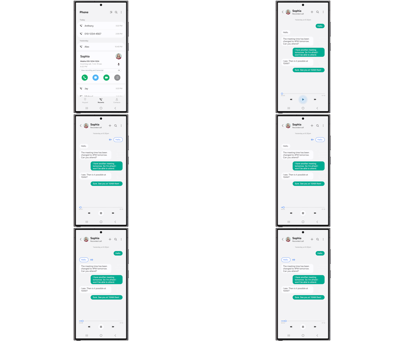
You can also use Galaxy AI to generate transcripts of calls recorded in the phone app. I haven’t tried this yet, but based on my experience with AI transcriptions inside Samsung’s voice recorder, I expect this to have some issues. It should be usable, but expect some typos.
Home screen changes
The home screen has seen some changes in One UI 7, and I’m a fan. The leaked app icon redesigns looked garish, but what we really got in the first beta looks great. The icons are vibrant and pleasing to the eye, and it’s easy to identify what each app does. My only criticism is that the camera and Expert RAW app icons look like they were pulled right out of the iPhone.
Big folders have been popular on a lot of Chinese smartphones lately, and Motorola even added them to its devices running Android 14. I’m pleased to say they’re also here in One UI 7. If you tap one of the app icons in the folder preview, it’ll open that app directly, while tapping the three dots in the bottom right corner will expand the entire folder.
Samsung’s first-party widgets have been overhauled and are more consistent than ever. The widgets adapt to whatever size you set them to, and you can even change the shape of the background for many of them. I’ve loved Samsung’s widgets for a few years, and One UI 7 only makes them better.
The Now Bar is like an island — a Dynamic Island
Like many others, I mocked Apple’s Dynamic Island when it debuted, but that changed once I used it for a bit. The information it shows while staying out of the way is helpful, as are the quick controls you can access. With One UI 7, Samsung is introducing the Now Bar — a similar feature to Apple’s Dynamic Island that somewhat manages to avoid looking like a direct copy.
The Now Bar sits between your chosen lock screen shortcuts at the bottom of the lock screen. The charging animation that plays when you first plug in your device appears here, as do other ongoing notifications like timers and voice recordings. This is also where the media controls live on the lock screen, and tapping on it expands it into a full-screen player. If you turn off your screen with the expanded player open, it’ll show on the AOD and remain open the next time you wake up your phone until you collapse it.
For timers, stopwatches, and ongoing voice recordings, the Now Bar shrinks itself up to the left of the status bar, next to the selfie camera. Tapping on it expands that activity and lets you perform certain actions, like pausing a recording, resetting a timer, or stopping the stopwatch. If you have multiple things running simultaneously, only the most recent will show here. While on the lock screen, they will be stacked at the bottom, letting you swipe through them.
I’m surprised call controls don’t appear here yet; in One UI 6, if you’re on a call, it shows a green chip with the call duration in the same place as where the Now Bar lives. I’d also love to see music controls next to the selfie camera, especially as they can’t be accessed from the notification shade anymore.
I like what I’m seeing with the Now Bar, but its usefulness will be limited even if Samsung adds support for calls and media playback. Apple had the same problem when Dynamic Island was first introduced, but since then, a lot of app developers have gotten behind it. Samsung will struggle to do the same unless something like this is baked into Android. Thankfully, that could happen in Android 16.
A cleaner camera app
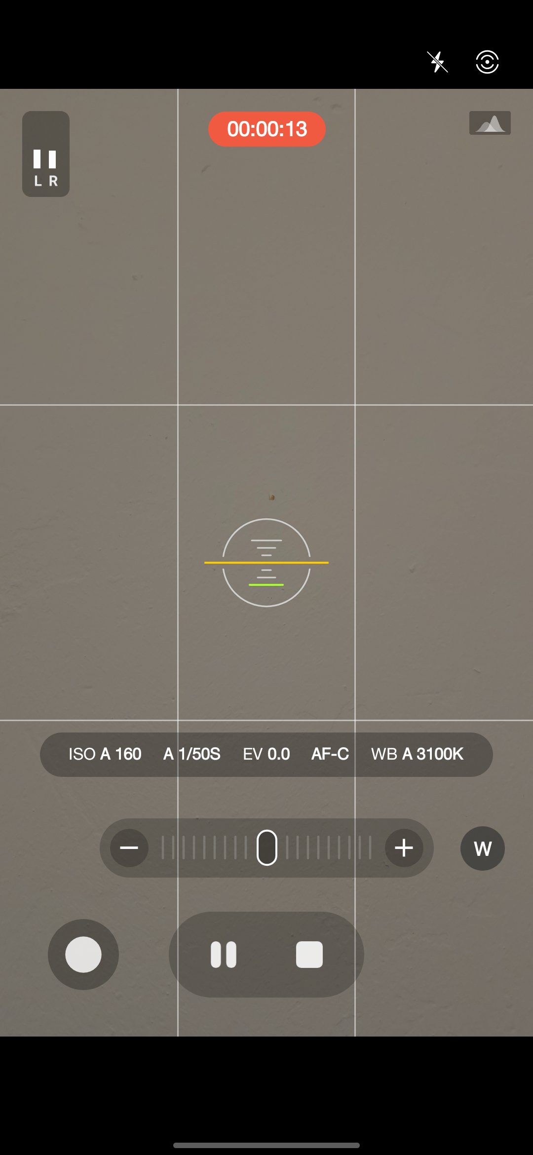
The camera app doesn’t have many new features, but it has been cleaned up. I’ve always liked One UI’s viewfinder because it makes all the options you need accessible. It became cluttered over time, though. Now, Samsung has neatened up the interface, moving all of the secondary controls to a collapsible menu that is summoned by tapping the button to the right of the zoom controls. It’s a good middle-ground, making the app cleaner while still being easier to navigate, at least to me, than the Pixel’s camera app. The Expert RAW app has received the same makeover.
Zac Kew-Denniss / Android Authority
Pro Video mode did get a nice quality-of-life update with a zoom bar that lets you smoothly zoom in and out at different speeds, dictated by how far you pull the zoom control. If you want to jump straight to a specific lens, tap the button to the right on the zoom bar, and the usual zoom shortcuts will show.
The verdict: Samsung stuck the landing
Robert Triggs / Android Authority
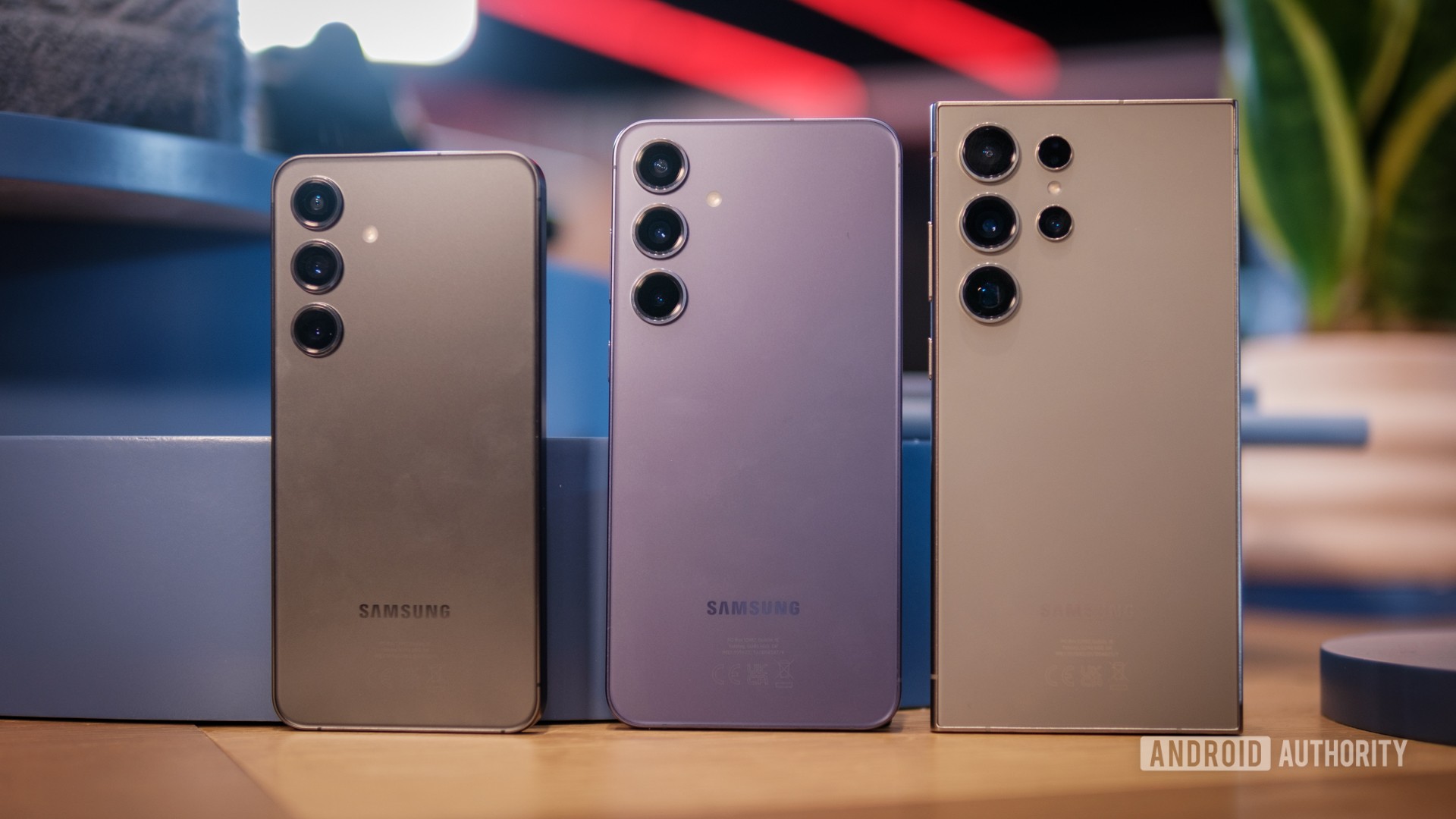
I was worried about One UI 7. I didn’t like the look of any of the leaks, especially the redesigned notifications and quick settings. That, combined with the fact that I don’t love my S24 Ultra as much as I loved my S23 Ultra, made me feel like it was time to switch back to a Pixel.
Now that I’ve tried One UI 7, there is nothing to worry about. This beta isn’t perfect; the battery life has been awful so far, and there have been occasional crashes, but that’s expected in a beta build. I like almost all of the changes Samsung has made here, mainly the little quality-of-life tweaks like alarm groups and the improved system animations. One UI 7 feels like the Samsung of old, which was never afraid to try new things, to throw ideas at the wall to see what sticks. This update does that without turning into the cluttered mess that was TouchWiz.
If you’ve got a Galaxy S24 and the beta is available in your country, you shouldn’t update yet. As much as I love One UI 7, it isn’t ready for use on a primary smartphone yet. I enjoy putting myself through the wringer by running unstable software on my phone, but most people don’t. Battery life is terrible; there’s the occasional app crash; and probably more bugs than what I’ve encountered in the 24 hours I’ve spent with it. If you can’t wait until next year for the stable release, at least wait until beta two or beta three arrives and starts to squash these pesky bugs.



_web.jpg?height=635&t=1734595314&width=1200)

