Tech
One UI 7 makes Samsung’s new and existing phones better than your iPhone and Pixel?
beta is anything to go by, it seems like Samsung has elevated its software game – finally!
One UI 7 finally gives my Galaxy S24 Ultra the “million dollar look” it deserves – design and animations matter!
The first thing I see in the One UI 7 beta is how clean and polished the interface feels. Samsung has subtly but effectively refreshed app shapes, widgets, and animations.
There’s now consistency in design that wasn’t as apparent in earlier iterations of One UI – so I guess the rumors were true. Apps and widgets now feel more aligned in terms of aesthetics, with softer edges and a design language that feels modern (whatever that means) yet true to Samsung’s “whole vibe” (whatever THAT means).
One UI 7.0 achieves another unique… achievement. It pays a clear homage to the iPhone’s hated/beloved Dynamic Island but in the most subtle way possible. More about that below.
One UI 7 makes Samsung’s camera app far more practical than my iPhone’s camera app – it’s all about ergonomics
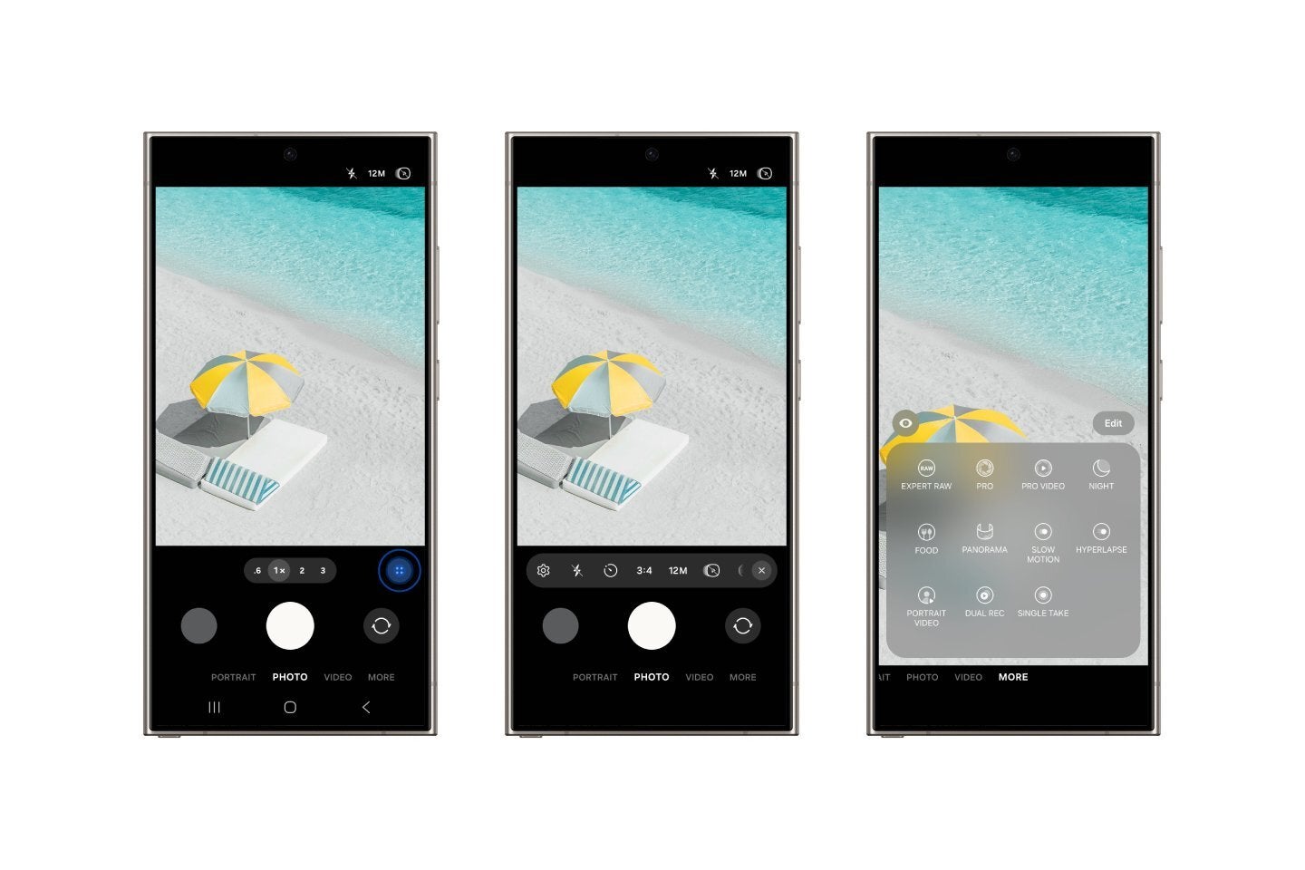

One of my favorite changes in One UI 7 must be the redesigned Camera app.
Samsung has completely overhauled the layout, moving all the essential (and perhaps non-essential?) controls to the bottom of the screen. For someone like me who uses a Galaxy S24 Ultra, this change is a lifesaver. Managing controls on a large phone has always been a challenge, but now everything feels within reach.
With the controls placed intuitively at the bottom, the camera feels more like an extension of your hand, making it easier to focus on taking photos/videos rather than trying to hit the settings button sitting in the top left corner (of One UI 6).
A TikTok-style makeover – One UI 7 lets will get you scrolling (and it just makes sense)
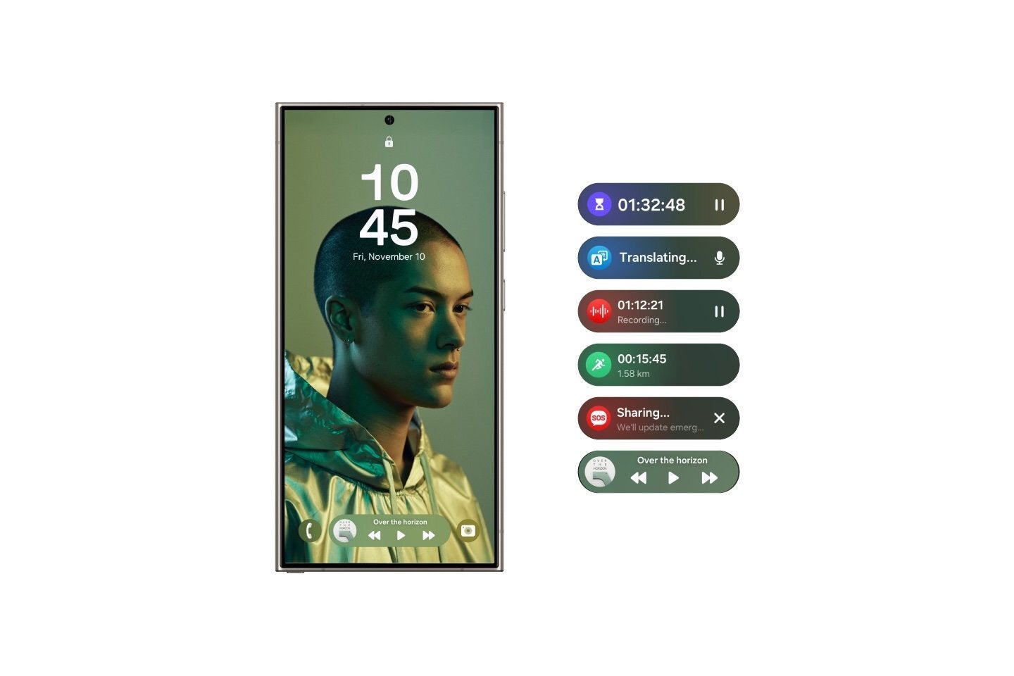

Another change I immediately noticed in One UI 7 is the shift to vertical scrolling in key areas like the app drawer and the Quick Actions panel Samsung has always been a fan of a horizontal, card-style layout – or in other words, swiping, so this change is a big one.
The vertical scrolling design aligns well with the taller smartphones we get today. It feels like Samsung has embraced how people use their phones, which is… a good thing. Right?
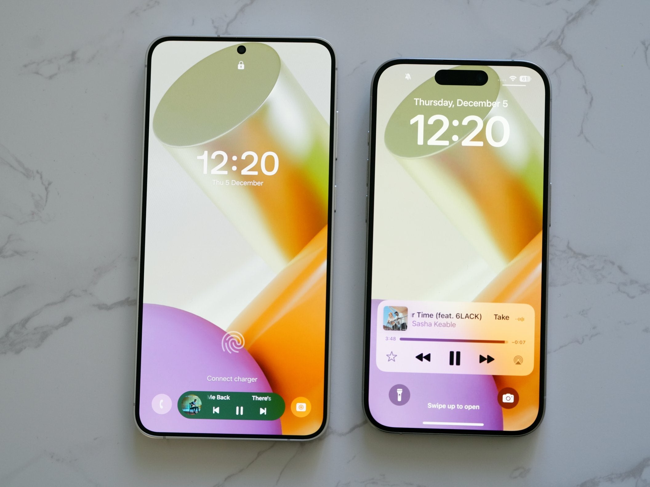
Samsung’s long-overdue answer to the iPhone’s Dynamic Island is “top stuff” – but on the bottom (where it should be!)

Interactive widgets are another area where One UI 7 shines.
In a nutshell, it seems to me Samsung has taken the concept of widgets and made them not just more visually appealing, but also more functional and customizable, which was long overdue.
From what I’ve seen, the new widget picker seems intuitive, with a clean design. Widgets now blend seamlessly into the home screen, with adjustable sizes and styles that seem more versatile than what’s offered in iOS or Pixel UI.
It’s a “Widget stack” all about making life easier by putting the things you need right on your lock screen. You can check notifications and jump into useful features like the Interpreter (Samsung’s Translator alternative), Music, Recordings, the Stopwatch, etc., without having to unlock your phone.
It finally feels like Samsung’s lock screen is doing something instead of just sitting pretty, as the Now Bar has the job to let you control ongoing tasks with just a tap (or two) – so you don’t have to keep diving into your apps to find what you’re looking for.
Since the Now Bar and new status bar pop-ups are (obviously) coming to the new Galaxy S25 series, I bet Samsung plans to keep adding functionality to them. For example, I’d like to have the options to add more relevant/often used controls there like WiFI, data, HotSpot, etc. Are you listening, Samsung?
Samsung “stole” the best from iPhone and Pixel to build the best Galaxy UI ever (and the best AI – duh!)
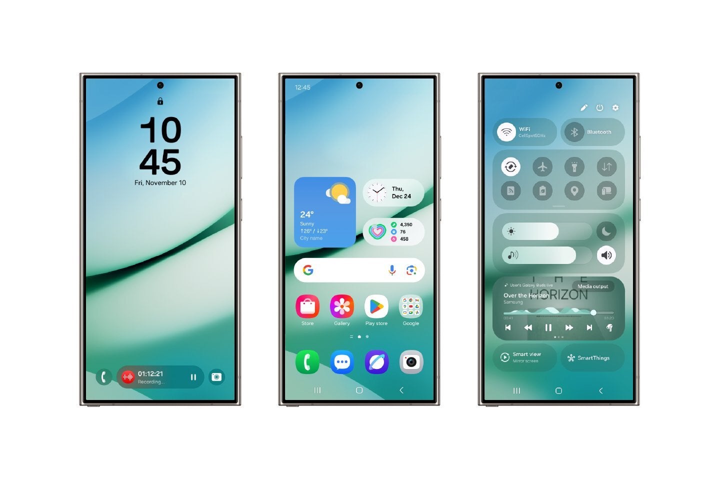

Overall, it’s impossible to ignore the influences that Google and Apple have had on One UI 7. The cleaner UI elements, smoother animations, and widget redesign clearly draw inspiration from iOS and Pixel UI. Yet Samsung hasn’t just copy-pasted these features – it’s refined and improved them to create something that looks and feels like “Galaxy”.
For example, while iOS is known for its seamless animations, it often sacrifices customization – even in the latest version of the iPhone’s software. On the other hand, Pixel UI excels in simplicity but feels too “vanilla” for me, which seems to be an opinion shared by many online.
And how can I forget Samsung’s industry-leading AI, which hasn’t received too many upgrades with One UI 7, but that’s only because (as I said), Galaxy AI is already awesome as is.
What sets One UI 7 apart is how practical and user-focused the redesign feels. Samsung has clearly taken user feedback into account, resulting in an interface that doesn’t just look good but also works better for everyday use. Features like enhanced multitasking, more accessible controls, and streamlined menus make One UI 7 feel like a software experience designed for real people.
On the other hand, iOS still lags behind in this area, with its limited multitasking capabilities, and while Pixel UI is arguably better than iOS in that regard, it still doesn’t offer the same level of flexibility.
Software matters too: One UI 7 should and will help Samsung sell even more Galaxy phones in 2025 – and for a good reason

From the redesigned Camera app and vertical scrolling to the polished widgets and smoother animations, every aspect of One UI 7 feels deliberate and well-thought-out. And of course, there’s the Now Bar, which feels like a less “cool” but more practical Dynamic Island.
Getting a new update that *really* makes your phone feel new isn’t a given nowadays – just ask iPhone 15 users.
In fact, I’m sure current and new Galaxy flagships will continue to outshine the iPhone in the area of practical AI features, as they do right now. Samsung had a head start in the area, and Apple is struggling to catch up.
And now… I’m looking forward to the Galaxy S25 and the final, public version of One UI 7. Because if the beta is anything to go by, it looks like Samsung might’ve just nailed it


