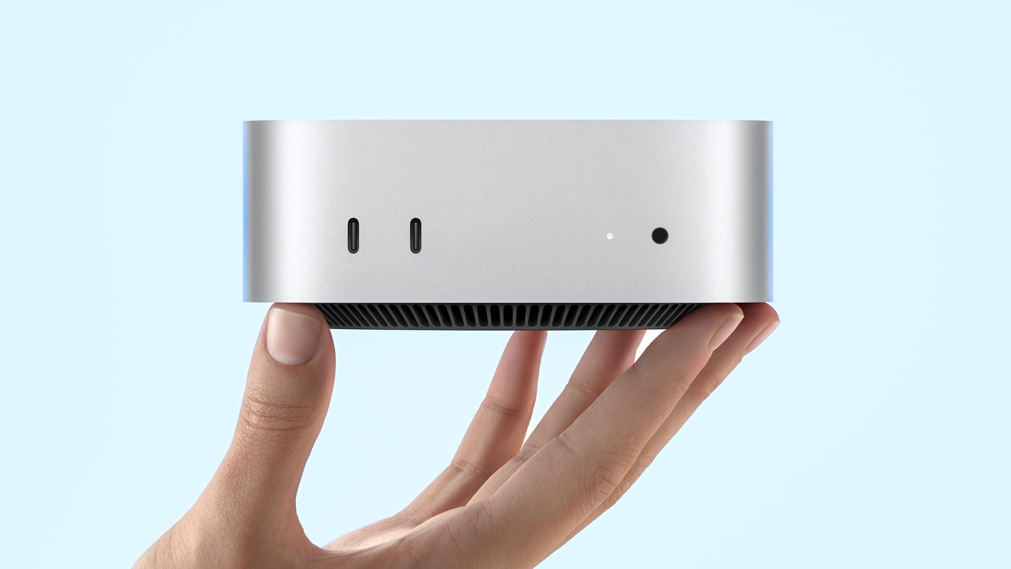
I won’t lie, the M4 Mac mini is incredibly exciting to me. I’ve been on the mini PC hype for a while now for their size and capability — falling in love with the Geekom Megamini G1 as a slick games console replacement.
The last bastion is what I use atop my desk. Currently, I’ve got an M3 Pro MacBook Pro connected to the Ugreen Revodok Max 213. But it looks very cluttered and the prospect of stripping all this out for a 5 x 5-inch square puck makes for the clean setup of my dreams.
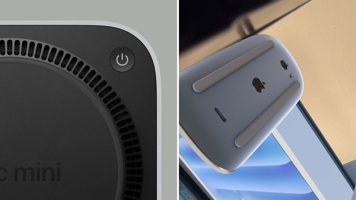
But there’s a problem. You see, Apple’s design team have been mostly bang on with its hardware creation. Mostly…except for putting a port on the underside of the Magic Mouse. I mean why put something so important as this in a position where you won’t be able to use it!?
And now, in a split second shot during Apple’s mini keynote about the Mac mini, I can see the Cupertino crew’s at it again with the power button being squished under the corner of this aluminum box. Yes, I realize this may sound like nitpicking on another level — a level equivalent to me trying to argue a 5+ year-old coupon is still valid at the local Walmart.
However, there are some valid concerns here that are making me rethink whether I should buy it or opt for one of the other best mini PCs you can snag.
Form over function
With any design decision, you have to achieve both of these in equal measure — something that looks good but isn’t there just for the looks. Apple is usually good at this tightrope balance with clean, functional hardware like the MacBook Pro and Apple Watch Ultra 2. Sometimes there’s a little wobble (looking at you, randomly placed Camera Control button that makes vertical shooting tricky), but on the main hand, the team nails it.
Putting the USB-C port directly in the center of the base of the Magic Mouse is an example of Apple falling off this tightrope. With literally any other wireless mouse, plugging in a cable to charge it doesn’t directly impact your ability to use it — but in the vein of keeping things clean, you physically can’t use the Magic Mouse while it’s charging.
And as for the Mac Mini, while the power button isn’t at least directly on the center of the underside (off on one of the corners that is slightly raised), the super low profile 2-inch height of this machine means you will have to wiggle your thumb underneath and lift the machine a little to power it on.
I get this sounds like the mother of first-world problems, but think about how mini PCs are integrated into setups. You’ve seen the kind of magic that my writer Anthony Spadafora gets up to right?
The prime use of a mini PC is to hide it as effectively as possible for a clean af setup. This means two things: memorizing its position and a little feeling around guesswork to hit the power button. For that use case, putting it in such a precarious position will make it next-level difficult to feel for that switch.
In both of these circumstances, form has absolutely taken over function.
What’s the fix?
Well, for both the Magic Mouse and Mac mini, it’s kind of easy. I know you’ve probably read hundreds of versions of this rant over the last couple days, so let’s do something different and entertain Apple’s fancy of wanting to hide buttons and ports.

For the Magic Mouse, Qi wireless charging is right there. There are a ton of new mice that sport it and completely eliminate the need for a visible charging socket. The easiest option would be to raise the touch surface slightly on the mouse and add a USB-C port to the front, but moving to wireless charging would be the Apple way to do it.
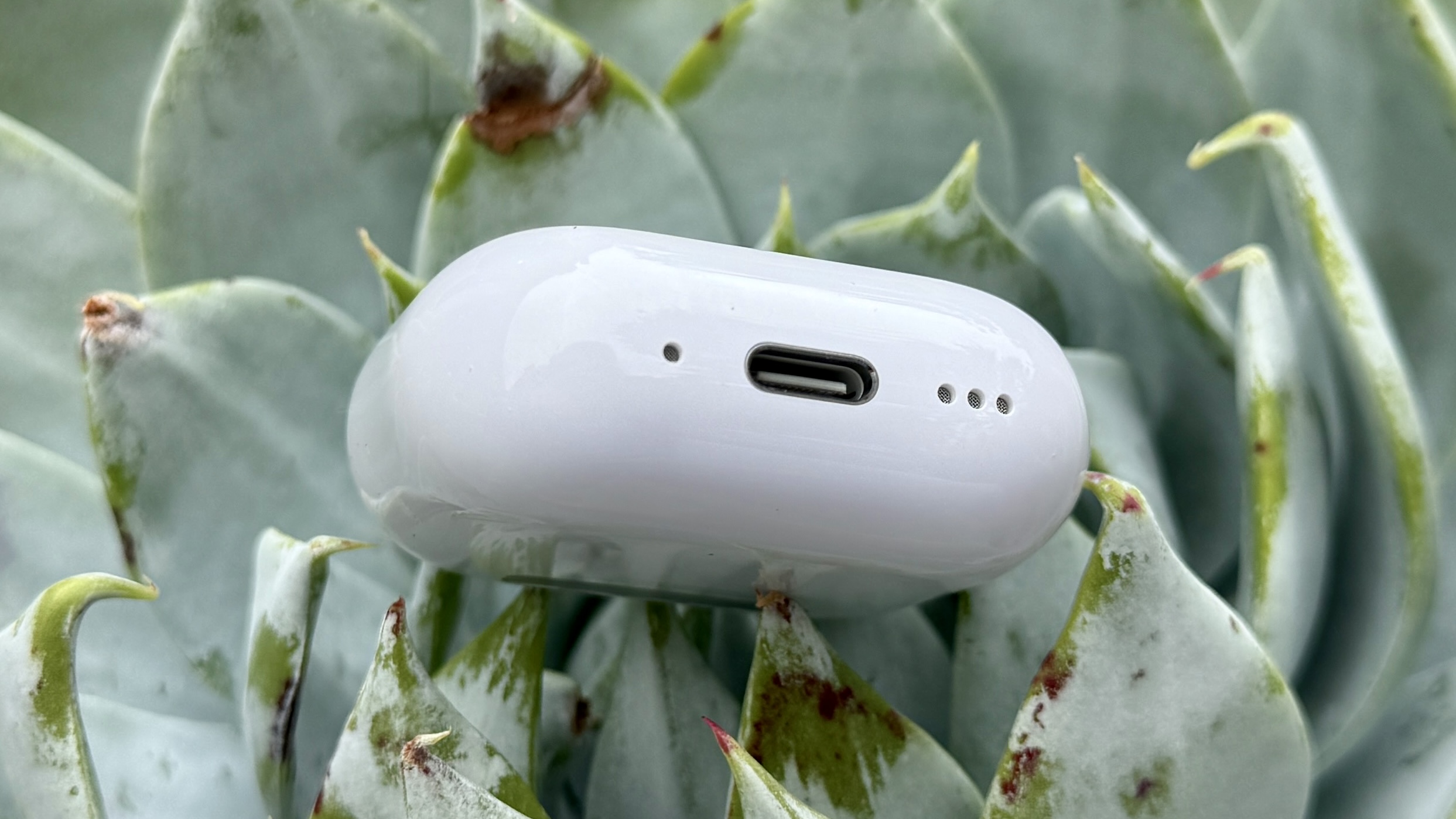
Whereas for the Mac mini, while the primary fix is always going to be “put the button on the front,” let’s think like Apple and look at the AirPods 4 for a second. The case for these buds has completely eliminated the need for a physical button, and in its place is a touch sensitive button area. Is it annoying? A little. But at least it’s in a logical place where your finger will go when pairing these little blighters.

Popping a touch sensitive button upon the front, side or back of the Mac mini (preferably with a raised ridge around it so I can feel for it when hidden into my setup) is immeasurably better than trying to stash a physical switch out of sight.
But in the immediate, I have one request going forward: please stop putting crucial interaction elements of your design in hard-to-reach, nonsensical places!


