Jobs
GDP, Jobs, Money, And Inflation Overview

primeimages
The past several weeks were spent on a family vacation in Maui, and it was wonderful. Maui is definitely back in business – we have never been so warmly received!
So it’s time to resume posting. It’s been a month, but my outlook hasn’t changed. I still think that the Fed has done enough to tame inflation, which, if measured correctly, is running comfortably within the Fed’s target range. The economy is growing at an unspectacular pace, with risks slightly skewed to the downside (but no signs of a recession). Most importantly, financial liquidity conditions are strong, and the outlook for corporate profits remains healthy.
Political risks probably outweigh economic risks at this point. Harris and Trump appear to be running neck-to-neck, and both espouse economic policies that are troubling. Trump is fixated on tariffs, while Harris is fixated on price controls, and either one would hamstring the economy. As much as I dislike Trump’s current stance, his intelligence and executive experience clearly “trump” Harris’, and the political leanings of Harris and Walz are way too far to the left for my taste. In any event, I can’t imagine Harris will survive close scrutiny, and she could easily implode, as did Biden in his debate with Trump.
Chart #1
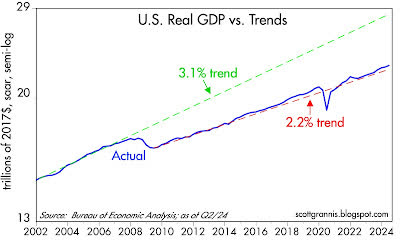
As Chart #1 shows, the US economy has been growing at about a 2.2% annual rate since mid-2009. No boom or bust is yet in sight.
Chart #2
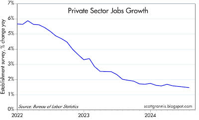
Chart #3
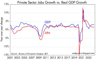
Private sector jobs growth (Chart #2) has been slowing for the past two years. At the current rate of about 1.5% per year, this is not enough to deliver overall growth of more than 2% or so (as Chart #3 suggests).
Chart #4
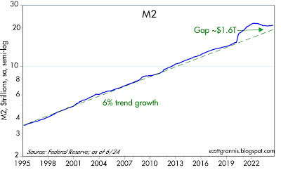
M2 growth continues to slow as well, as Chart #4 shows. The huge bulge in M2 was the by-product of $6 trillion of fiscal “stimulus” doled out by the Trump and Biden administrations, and it was in turn the proximate cause of the inflation bulge. Both are now in the past, and monetary conditions continue to return to some semblance of “normal.”
Chart #5
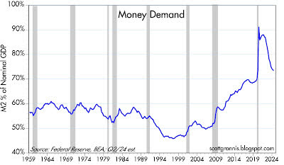
I have argued for years now that the behavior of money demand and money supply easily explain the rise in inflation which began in early 2021 and which peaked in mid-2022. The initial surge in money was offset by an equal surge in the demand for money, which is why inflation didn’t surge until early 2021. But after that, and as the economy got back on its feet post-Covid, the demand for money (Chart #5) collapsed. The public began spending the money that had been stockpiled during the Covid shutdowns, and it was a classic case of too much money chasing too few goods (which were constrained because of supply chain shortages). Money demand is now approaching some semblance of normal.
Chart #6
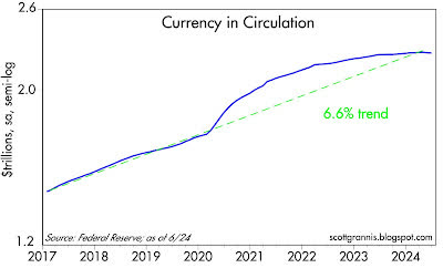
This same dynamic played out with currency in circulation (Chart #6). During the panic of 2020, most people wanted extra cash in their pockets, if for no other reason than that it was difficult to spend it. That has completely reversed. The ratio of currency in circulation to nominal GDP is now less than 1% higher than it was prior to the onset of Covid lockdowns.
Chart #7
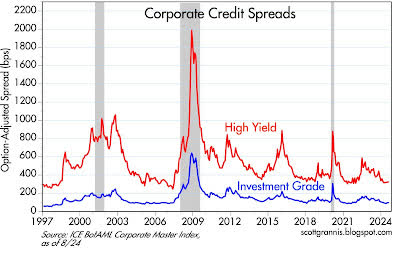
Chart #7 shows the spread between investment grade and high-yield corporate debt and Treasuries, which is an excellent barometer of the market’s expectations for future profits (lower spreads being good). The current level of spreads also suggests that financial market liquidity is abundant, and that in turn reflects confidence in the health of the economy.
Chart #8
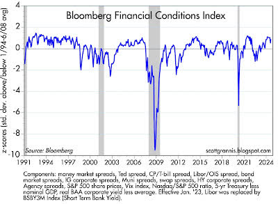
Chart #8 shows the level of Bloomberg’s financial conditions index, which uses a variety of money market inputs to gauge the overall health of the financial markets. Conditions appear to be substantially normal here as well, with no signs of distress.
Chart #9
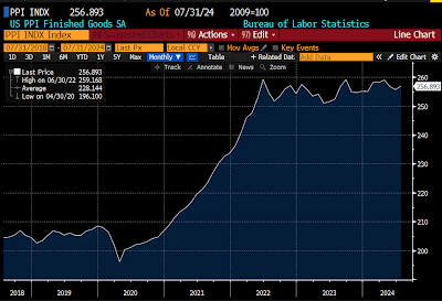
Chart #9 shows the level of the Producer Price Index, which measures inflation pressures early in the production pipeline. As should be evident, there has been zero inflation according to this measure since mid-2022. In fact, the price level according to this measure has actually fallen by 0.9% since June ’22 when inflation peaked.
Chart #10
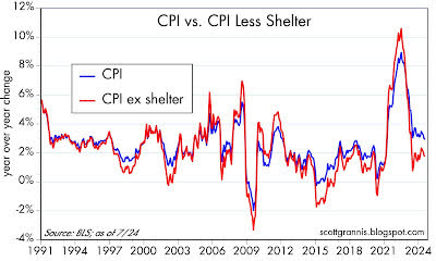
The Consumer Price Index rose 2.9% in the year ended July ’24, but roughly one-third of that increase came from shelter costs (as I’ve explained repeatedly over the past year or so). Chart #10 shows the changes in the CPI and the ex-shelter version of the CPI, the latter of which has increased by 1.78% in the past year and only 1.45% annualized over the past two years.
Moreover, the CPI is up at an annualized rate of only 0.4% annualized in the past three months, while the ex-shelter version has fallen at an annualized rate of -1.5%!
Chart #11
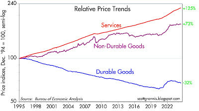
Chart #11 shows the three major components of the Personal Consumption Deflator, arguably the best measure of inflation at the consumer level. What stands out here is that, since the inflation peak of mid-2022, prices of durable goods have declined, and prices of non-durable goods have risen by a mere 0.9%. Substantially all of the measured inflation in the past two years comes from “services,” which are in turn dominated by shelter costs.
Chart #12
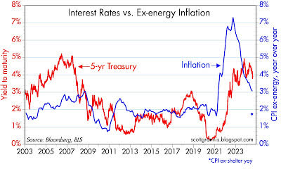
Chart #12 compares 5-y Treasury yields to the ex-energy version of the CPI (I use this measure because energy prices have been extraordinarily volatile in the past two decades). Note the blue asterix at the bottom right-hand side of the chart, which marks the year-over-year change in the CPI ex-shelter (1.78%). At this level of inflation, and based on past relationships, a 5-yr Treasury yield of between 2% and 3% would not be unreasonable at all.
I see no reason for the Fed to delay a move to lower interest rates substantially.
Editor’s Note: The summary bullets for this article were chosen by Seeking Alpha editors.


