Tech
Google Photos readies ‘Collections’ tab and clutter filter
Google Photos is preparing to replace the Library tab with a redesigned “Collections” page alongside a new way to filter out “clutter.”
About APK Insight: In this “APK Insight” post, we’ve decompiled the latest version of an application that Google uploaded to the Play Store. When we decompile these files (called APKs, in the case of Android apps), we’re able to see various lines of code within that hint at possible future features. Keep in mind that Google may or may not ever ship these features, and our interpretation of what they are may be imperfect. We’ll try to enable those that are closer to being finished, however, to show you how they’ll look in the case that they do ship. With that in mind, read on.
In Google Photos today, the Library tab includes a handful of shortcuts (Favorites, Utilities, Archive, and Trash), a carousel of your on-device folders that contain images, and a master list of your saved albums. The company previously attempted to redesign the Library tab in 2022, but this was rolled back less than a month later following negative feedback.
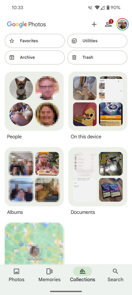
Now, it seems the Google Photos team is giving it another try by reworking the Library tab to become a new Collections tab, which our team managed to manually enable. For starters, you’ll find the same four shortcuts at the top, albeit with a smaller, rounder design.
Below those, you’ll find square cards for “People & pets,” “On this device,” “Albums,” “Documents,” and “Places.” Each of those cards has a preview of some of what you’ll find inside. And all the way at the bottom, there are three additional shortcuts for “Screenshots,” “Videos,” and “Recently Added.”


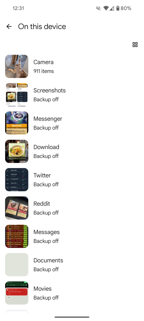
Some options, like People & pets, offer the same experience you’d get by accessing the same option in the Search tab. Meanwhile, others, like On this device, have been significantly tweaked. Below each folder, you’ll now see either how many images have been backed up or if backup has been turned off. A button in the top-right corner makes it easy to swap between list and grid views.
Overall, the Collections tab seems to cover all the same bases as the previous Library tab while cutting down on some of the clutter. That said, you may need an extra tap or two to get to a particular set of photos.
Elsewhere in the app, our team has uncovered some upcoming filter options that should help hide some of the clutter from your photo library. Specifically, Google Photos will attempt to recognize “screenshots, GIFs, and memes” and allow you to filter those out of your feed. More broadly, the filters appear to be targeting “Photos from other apps.”
Hide clutter
Backed-up photos like screenshots, GIFs, and memes are hidden
Ideally, you wouldn’t want to waste cloud storage space by backing up most of those kinds of images in the first place (unless you’re a master meme-maker looking to preserve your works). But, for those that do, this should be a nice upgrade to keep your Google Photos library relevant and uncluttered.
Thanks to JEB Decompiler, from which some APK Insight teardowns benefit.
More from APK Insight:
FTC: We use income earning auto affiliate links. More.


