World
How Science in Sport Stood Out in a World of Reductive Copy | LBBOnline

Last year, nutrition brand Science in Sport (SiS) sponsored the Tour de France, which led to the creation of the unforgettable ‘The Tour’ campaign, in collaboration with M&C Saatchi, to present to us ‘one of the most beautiful depictions of hell [we’ll] ever see’.
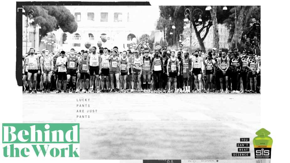
This year, SiS returns to unveil its newest brand platform – ‘You Can’t Beat Science’. Helming the platform is a campaign aimed directly at endurance sport enthusiasts – those who go on 100-mile cycles on a Sunday morning, or “train for multiple marathons or triathlons a year.”
With the help of M&C Saatchi’s The Source, the agency and SiS found out that for most amateur endurance athletes, the thrill of training doesn’t come from winning a competition against others, but one against themselves. A combination of research methods revealed a real challenge-driven mindset in SiS’ audiences, which led to the vision for this new fully black-and-white print campaign.
The archival footage is crowned by simple variations of copy, reminding us that science beats your lucky pants when it comes to achieving personal goals. And SiS will always be there, as a sure way to follow science’s rules if you want to win against yourself.
LBB’s Zoe Antonov spoke to M&C Saatchi’s creative directors Alex Lucas and Jon Farley, account director Katie Mandel and strategist Shaun Okoh, to find out more about the making process and meaning behind the campaign.
LBB> Tell me more about Science in Sport’s new brand platform ‘You can’t beat science’ and its predecessor ‘The Tour’ – what are the common themes between them and what defines the brand trajectory that SiS is on, looking at the two platforms’ differences?
Alex & Jon> Highlighting SiS’s sponsorship of ‘Le Tour’ was the first thing we were tasked with by the brand. We all got on like a house on fire with the client, so we knew we were going to make some fun work. The Tour de France is known as one of the most brutal tests of stamina in the sporting world and we needed to show that SiS understood what the riders go through. The brief was about the beauty of pain, which is exemplified best in the ‘Hell’ print execution.
‘The Tour’ was more about their sponsorship of the race and legitimising their involvement, while the brand campaign was very much starting from scratch to help SiS find its positioning and tone of voice when talking to consumers. Everything about SiS screams precision, research and above all science, so we took this as our starting point for developing a line.
We kept coming back to the idea that science deals in facts, so you can rely on them. The products and the work that SiS do is all based on research and results, so we thought that if you’re using SiS products then you’re relying on something pretty concrete to help you take your performance to the next level.
There’s also a lot of myth and superstition around sport, which can’t be quantified or proven, so we wanted to position the products as the antithesis to this.
LBB> In that line, what is the difference between SiS and other sports nutrition brands on the market today?
Katie> Science in Sport is the world’s leading performance nutrition brand. Combining world-class knowledge and scientific formulations to provide optimal performance solutions across the nutritional need states of energy, hydration, and recovery.
Through a world-leading research and innovation programme, they formulate evidence-based products that truly impact performance.
They push the boundaries of science and nutrition like no one else on the market, so you can push the boundaries of performance. Everything they do is fuelled by science.
LBB> Who was this new brand platform aimed at and how did you make sure it reached the correct audiences?
Alex & Jon> The new platform is aimed at anyone looking to take their sporting performance to the next level. These are people looking for an edge as they already train hard and take their sport seriously. The adverts were also placed in magazines that only people who were into their sport would read.

LBB> What kind of research did M&C Saatchi’s The Source employ and what were the results? How did this change the direction of the campaign if at all?
Shaun> We carried out qualitative consumer research to understand core motivators and drivers of endurance athletes in relation to sports nutrition, and assessed responses to a range of different creative platforms and territories.
What we found was that most endurance athletes like a product that they can rely on to give them that extra boost and bit of support when the going gets tough. But ultimately, they are the ones doing the hard work and putting themselves through gruelling, impressive tasks. It’s a matter of both mental and physical strength and skill.
This insight enabled us to understand that as a brand we can’t be too bolshy about our role, but we can be confident with stating that when the going gets tough and you’d like a helping hand, you can’t beat out products. We’re not saying we’re solely responsible for your personal greatness and achievements, but we can be relied on to be the best you can get to help you go that extra mile.
LBB> Why was print the best medium for this campaign, and in turn, why was black and white photography the best creative direction?
Alex & Jon> We know our audience is into their sports and that they take the time to sit down and read specialist magazines. We thought this was a great moment to catch them.
Black and white photography felt like the perfect fit for this campaign as it makes the images feel more clinical and stripped back, which mirrors the brand’s scientific approach to everything they do. And, as it happens, sports brands are all employing highly saturated and colourful images at the moment, so it helps us to stand out from the crowd.
LBB> Who are the people in the images?
Alex & Jon> Some of the people are athletes sponsored by SiS, while others are serious amateur athletes. We used archive footage, which we felt would be more authentic than shooting new scenes. They’re athletes at the top of their game. If SiS products work for them, then they are going to work for the average athlete looking to make gains.
LBB> Tell me about the typography on the photographs, as well as what inspired the copywriting.
Alex & Jon> We wanted the typography to continue the scientific theme, so we chose something functional and utilitarian that we felt could be used for recording data.
LBB> What was the most challenging aspect of this campaign, and what was the most fun one?
Alex & Jon> The most challenging aspect of the campaign was probably getting signoff for the images we wanted to use. The rest of it was, to be honest, an absolute pleasure. We loved having the opportunity to write a campaign line from scratch, to come up with a look and feel and to sweat the detail on the copy and the art direction. Even writing the body copy was a joy.
LBB> Any final thoughts?
Alex & Jon> There’s a trend for reductive print and out-of-home at the moment, which seems to be slightly at the expense of the reason to buy or use the product. It was nice to write a campaign line that gives you a clear reason to buy the product, and a campaign that brings it to life using different insights associated with endurance sport.


