
Samuel Axon
Apart from the much-ballyhooed (and delayed) Apple Intelligence, a big change to home screen customization and app icon placement is one of iOS 18’s flagship features, alongside an overhauled Control Center.
With the public launch of iOS 18 this week, we’ll be delving into those flagship features one by one, and I’m starting with the home screen because I have often criticized the iPhone’s home screen experience in the past. iOS 18 promises the biggest update to home screen customization since, well, ever.
Let’s walk through how to use the new features, explore how they work, and try to answer the most important question: does the iPhone finally offer the kind of home screen flexibility that users have been asking for?
How to customize the home and lock screen in iOS 18
First up, let’s talk about how you access the new capabilities.
For the home screen, you still get to the customization options by long-pressing in the open space between the icons on any home screen page. This initiates wiggle mode. In the past, you could simply move apps from here, or you could tap a “+” button in the top-left corner to pick a widget to add.
Now the + button has been replaced by an “Edit” button. Tapping that brings up a drop-down menu with three options: Add Widget, Customize, and Edit Pages. Add Widget does what the + button used to do.
Edit Pages brings up a view of all your home screen pages, allowing you to check or uncheck each to see whether it’s included when you’re swiping around or not. (This is the same screen you got by tapping the dots representing the pages at the bottom of the home screen in wiggle mode before, and you can still get there that way, too.)
Customize, on the other hand, brings up a panel in the lower third of the screen that we didn’t have in this form in iOS 17. It lets you toggle between dark and light modes and change the size of icons from small to large (more on that soon).
-
To access the new customization options, you start by long-pressing the home screen until you get this wiggle mode…
Samuel Axon -
Then you tap the “Edit” button in the top-left corner…
Samuel Axon -
…and that brings up this customization panel in the lower part of the screen.
Samuel Axon
Additionally, there are four icons across the middle of the panel: Light, Dark, Automatic, and Tinted. Switching between Light and Dark changes Apple’s built-in icons (and any third-party app icons that have added support for this) to different color schemes, so an icon that was always white before is now just white in the Light setting, but it’s a dark gray in the black. (The Automatic setting switches between these are based on whether the system-wide Light or Dark mode is enabled.)
That’s neat, but things get really crazy with the Tinted option. This will tint every icon on the screen to one color—kind of like you could do with your home screen wallpaper before. These icons tend to resemble the dark mode versions, I’ve found, but the tint is strong. This applies to all icons, not just those of apps that have been programmed to support it.
-
This is light mode…
Samuel Axon -
…and this is dark mode. Notice that some icons changed, but not others; developers need to support this.
Samuel Axon -
This is tinted mode, which works whether developers have added support or not. In this case, the color matches the background, but you can go a different route if you want.
Samuel Axon
There’s also a color picker, so you can grab a color from your wallpaper to apply it to the icons, which is neat.
This uniform splash of color won’t be to everyone’s tastes, but it does breathe some life and uniformity into the chaos that was the old home screen of apps.
The biggest answer to that chaos comes in the form of freely placeable app icons, though.
The dreaded wiggle mode gets a little less dreaded
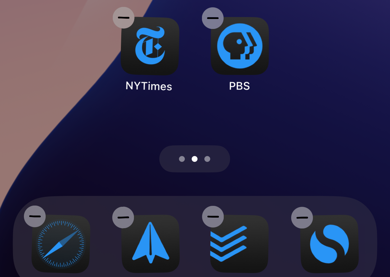
I’m not a fan of wiggle mode, that situation where all your icons shake and you drag them around your home screen as they displace one another in rows.
It’s visually chaotic, and it’s easy to accidentally create a folder or drop an icon in the wrong place. When widgets are involved, you can break your whole layout as a misstep cascades across pages of apps, bumping icons to pages they’re not supposed to inhabit. I found it persnickety and inefficient.
Whether or not everyone else feels quite as strongly about it, I’ll venture that most of us would like to at least be able to put icons wherever we want on the screen, like you’ve long been able to do with Android or a Windows (or Mac) desktop.
-
Behold, you can place icons wherever you want on the grid!
Samuel Axon -
I tried making a smiley face, but would have needed one more horizontal row. Oh well!
Samuel Axon
You still use the old wiggle mode interface to do this, unfortunately. But because it’s now possible to place an icon on the home screen’s grid without another icon in the space to its left or above it, you can avoid a lot of the pain we had to deal with before.
Dragging an app icon amid other closely positioned app icons on the grid still follows the same rules as old wiggle mode: It will displace whatever’s there and shift things around a bit. You’ll still have to deal with that behavior if you want to have a home page screen that’s dense with icons.
But placing an icon in a spot that’s not already occupied just places it there, without affecting any other icons. You can place all your icons along one edge of the screen or alternate spots or make weird shapes. You can do whatever you want!
Yes, each icon still has to fall into a grid spot, so it’s not totally freeform—but it’s miles ahead of what we had before.


