Tech
Live Activities on Android? Android 15 tests lock screen change reminiscent of iOS

TL;DR
- Google is testing a change in Android 15 that moves the At a Glance widget to the bottom of the lock screen.
- The At a Glance widget is currently positioned near the top, right below the date.
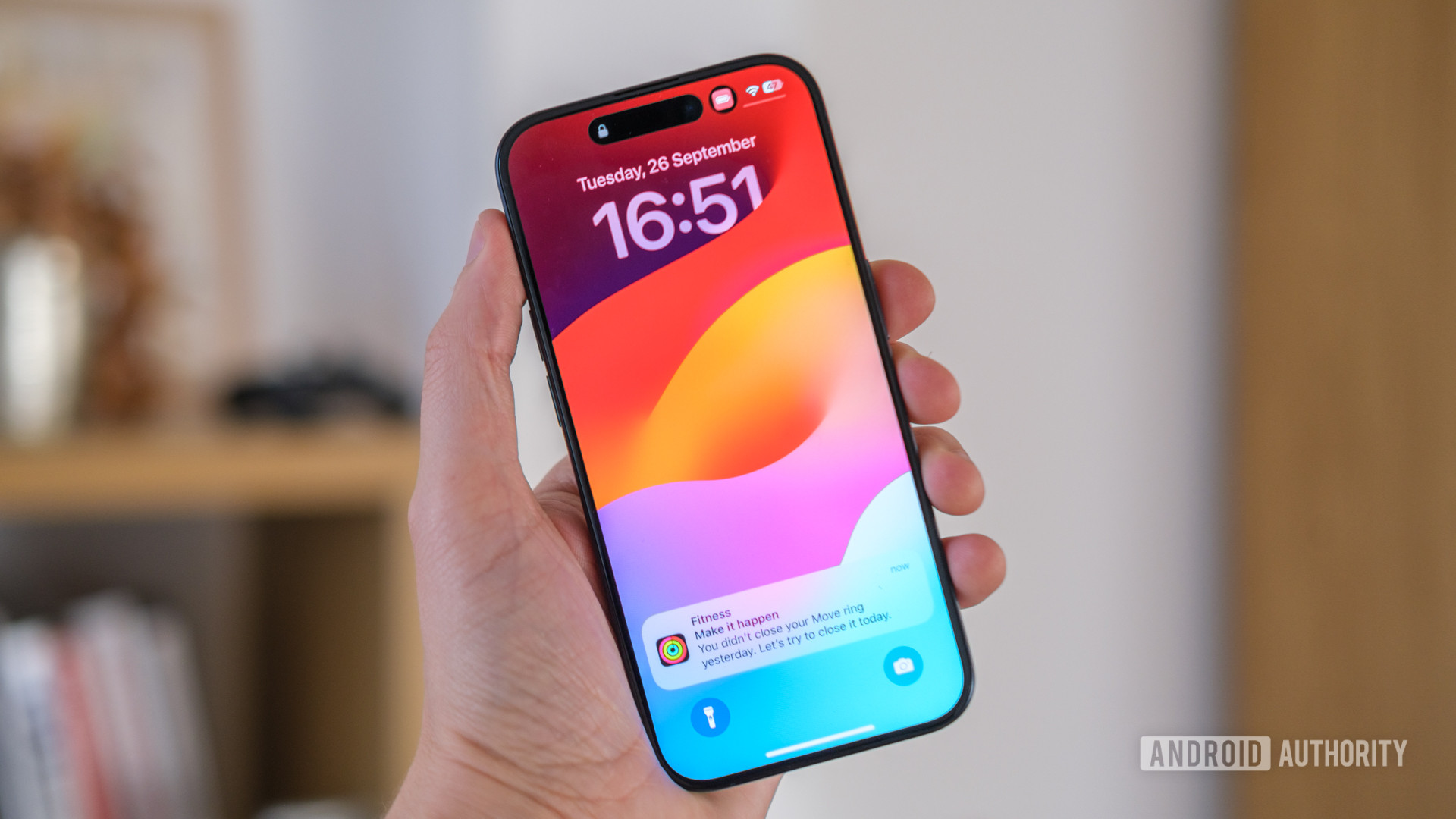
- Live Activities in iOS — a similar feature — are also placed at the bottom of the lock screen.
Android widgets offer quick access to app shortcuts or useful information right from your home screen. The Android OS used to let you add nearly any widget to the lock screen until Android 5.0 was released nearly a decade ago. While some manufacturers like Samsung have kept the lock screen widget dream alive, Google hasn’t shown much interest in reviving the feature.
As we first reported earlier this year, though, Google is finally bringing back lock screen widget support in Android 15, though this feature might be limited to tablets. Even though Android 15 may not let phones add widgets to the lock screen the same way that tablets might be able to, the operating system may offer another way to do this. The method Google might use should be familiar to anyone who’s used an iPhone because the approach seems pretty similar to Live Activities on iOS.
Before I explain any further, I need to bring up how Google plans to handle lock screen widgets for tablets running Android 15. Widgets won’t appear directly on the lock screen for tablets; instead, they’ll appear in a separate space that’s accessed by swiping inward from the right edge. This article I previously wrote goes into more detail about how lock screen widgets will work for tablets in Android 15, in case you’re curious.
This approach wouldn’t really work on phones since they have much smaller screens. However, the approach that iOS took to bring widgets to the lock screen is quite elegant, so there wouldn’t be anything wrong with Google using a similar approach. In fact, Google already has a great starting point to build the feature in At a Glance.
At a Glance, in case you aren’t familiar, is a widget-like element that exists on the home screen and lock screen of Pixel devices (Google also offers a stripped-down version of At a Glance to third-party OEMs, but few utilize it). The cards you swipe through in At a Glance are built on top of the Smartspace API. Android widgets, on the other hand, are built on the RemoteViews API. Smartspace currently doesn’t handle RemoteViews, but this is something that Google has quietly been working to change behind the scenes. If Google were to, say, finish RemoteViews support in the Smartspace API and then enable showing raw widgets from third-party apps in At a Glance, then we’d effectively get third-party widgets showing on the lock screen.
Of course, things aren’t as simple for Google as “just” including RemoteViews support and then showing any third-party widget. The company would need to ensure that any included widgets adapt to fit in the limited area given to At a Glance on the lock screen. It would also need to ensure that third-party widgets won’t crash At a Glance and potentially the whole lock screen. Plus, it would need to work with more OEMs to include At a Glance in their lock screens.
Another challenge that Google would need to consider is where to place the revamped At a Glance view. Currently, it’s shown underneath the date on the lock screen, which is towards the top. Google is experimenting with moving At a Glance to the bottom of the lock screen, though, which is the change that most reminds us of Live Activities in iOS.
We had to enable a few flags in Android 15 Beta 1.2 to make At a Glance appear at the bottom, so we aren’t sure if this is anything more than a test or if Google actually plans to move forward with repositioning it. Also, to better show off the repositioned At a Glance, we disabled the two shortcuts on the lock screen since they can sometimes overlap. Furthermore, the lock screen feels a bit busy when it shows both notifications in the middle and a swipeable At a Glance carousel at the bottom.
Because of this, we think there’s still some work that needs to be done before At a Glance can be moved to the bottom, but this is a promising step towards bringing back lock screen widgets to phones. We don’t know if or when these changes will land, but it’s possible we won’t see this launch until the next major release of Android after Android 15, ie. Android 16 in 2025.


:quality(70):focal(338x272:348x282)/cloudfront-us-east-1.images.arcpublishing.com/shawmedia/FOAF2O2ZIBEC5FYGY6GCKFXN3E.jpg)


