Tech
Samsung Galaxy S25 Ultra mock-ups by Ice Universe show slightly rounded corners

Samsung has had a fairly consistent design for its premium S-series, though every year there are tweaks that try to improve looks and ergonomics. They have had varying success. The Galaxy S Ultra in particular has settled on a rectangular design whose sharp corners look stylish but really tend to dig into your palm. The Galaxy S24 Ultra may be the worst in that regard – here’s a 3D view next to the S23 Ultra.
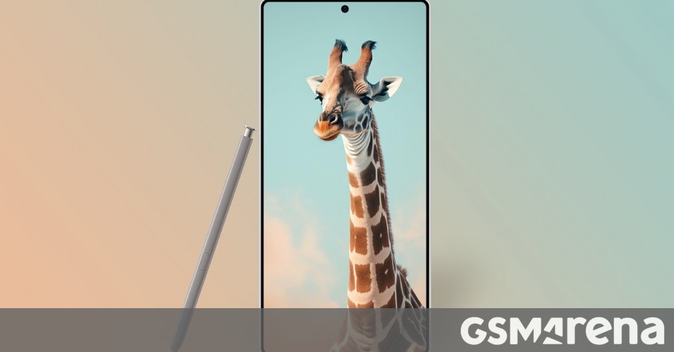
Samsung may finally be changing course and going for a rounded design. Famed leaker and outspoken Samsung critic Ice Universe has shared these mock-ups of the upcoming Samsung Galaxy S25 Ultra.
Samsung Galaxy S25 Ultra mock-ups
That’s right, the corners are no longer palm-piercing 90° angles. For a while now Ice has been saying that the S25 Ultra design will move closer to the S24 and S24+. This means a flat (at least flatter) front and back.
There might be some asymmetry there – the back might remain more rounded than the front, giving the phone a softer shape that would be more pleasant to hold.
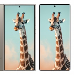
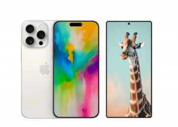
Here are some hypothetical comparisons with the current Galaxy S24 Ultra and the upcoming iPhone 16 Pro Max. The new S-flagship has rounded corners – both on the frame and on the display – and it is quite noticeable next to its predecessor. Next to the iPhone, however, the new Ultra still looks quite rectangular.


Mock-ups: S24 Ultra vs. S25 Ultra • iPhone 16 Pro Max vs. S25 Ultra
What do you think – is this the right direction for the next Ultra?


/static.texastribune.org/media/files/f5fdb1dff4d6fd788cba66ebaefe08d0/Paxton_GOP_Convention_2018_BD_TT.jpg)


