Tech
The Pixel Launcher could finally show full app names in your app drawer
Summary
- Android 15 Beta 1.2 brings a new toggle to the Pixel Launcher to display the full names of apps in search results and the app drawer.
- This feature has been in development since early 2022 but could finally go live with Android 15 this fall.
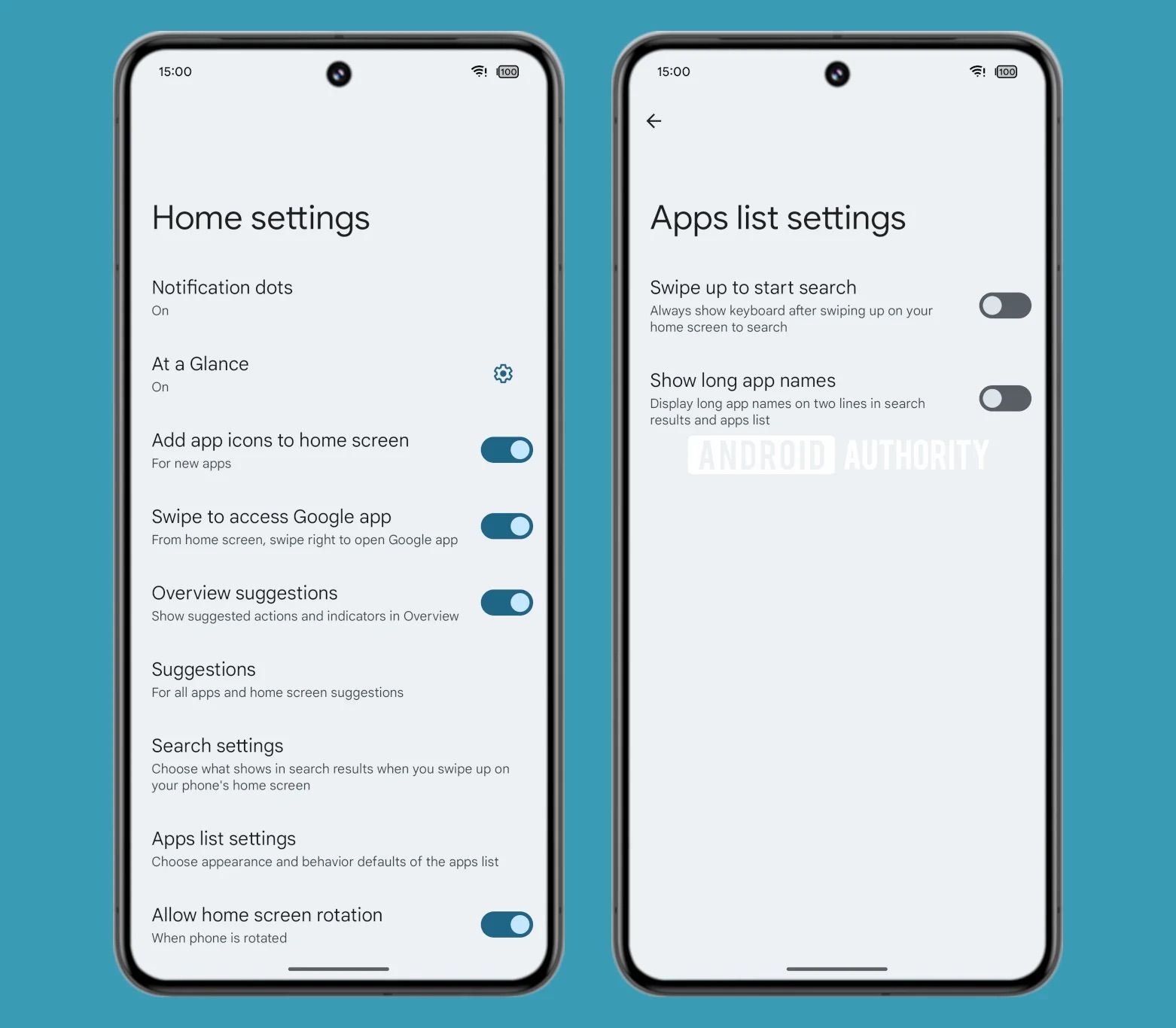
- Users will find this new toggle inside the Apps list settings option, situated within the Pixel Launcher’s Home settings page.
Android 15 Beta 1.2 arrived just days after Beta 1.1 earlier this week. While the latest beta contains a bevy of bug fixes left over from the previous release, it appears that Google is also keen on making some other long-overdue adjustments to the system, specifically the Pixel Launcher.
Android 15 Beta 1.2 arrives out of nowhere with a set of serious fixes
Just three days after Beta 1.1
Thanks to some digging by Android expert Mishaal Rahman (via Android Authority), we’re learning that the Pixel Launcher may finally allow users to display the full names of applications in the app drawer. In its current form, names in the app grid are shrunk down to save space. But in Android 15 Beta 1.2, Rahman found that the Pixel Launcher can display the full name of the app by leveraging the space just below it.
The newly added Apps list settings page and the dedicated toggle
There’s even a new Apps list settings page within Home settings containing the toggle to Show long app names. The corresponding text explains how apps with longer names will leverage two lines to display their full name, with the caveat that this change would apply to the apps list and search results. This means this two-line method won’t apply to the apps on your home screen, as Rahman notes.


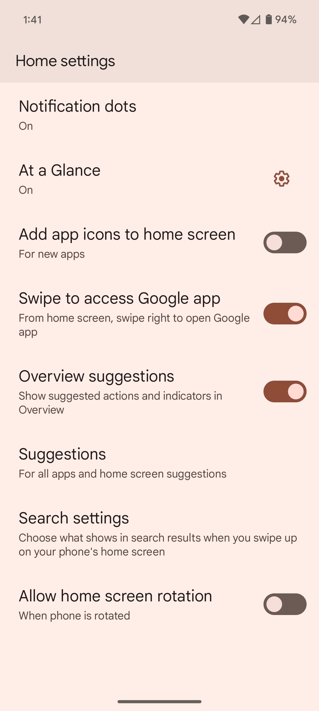
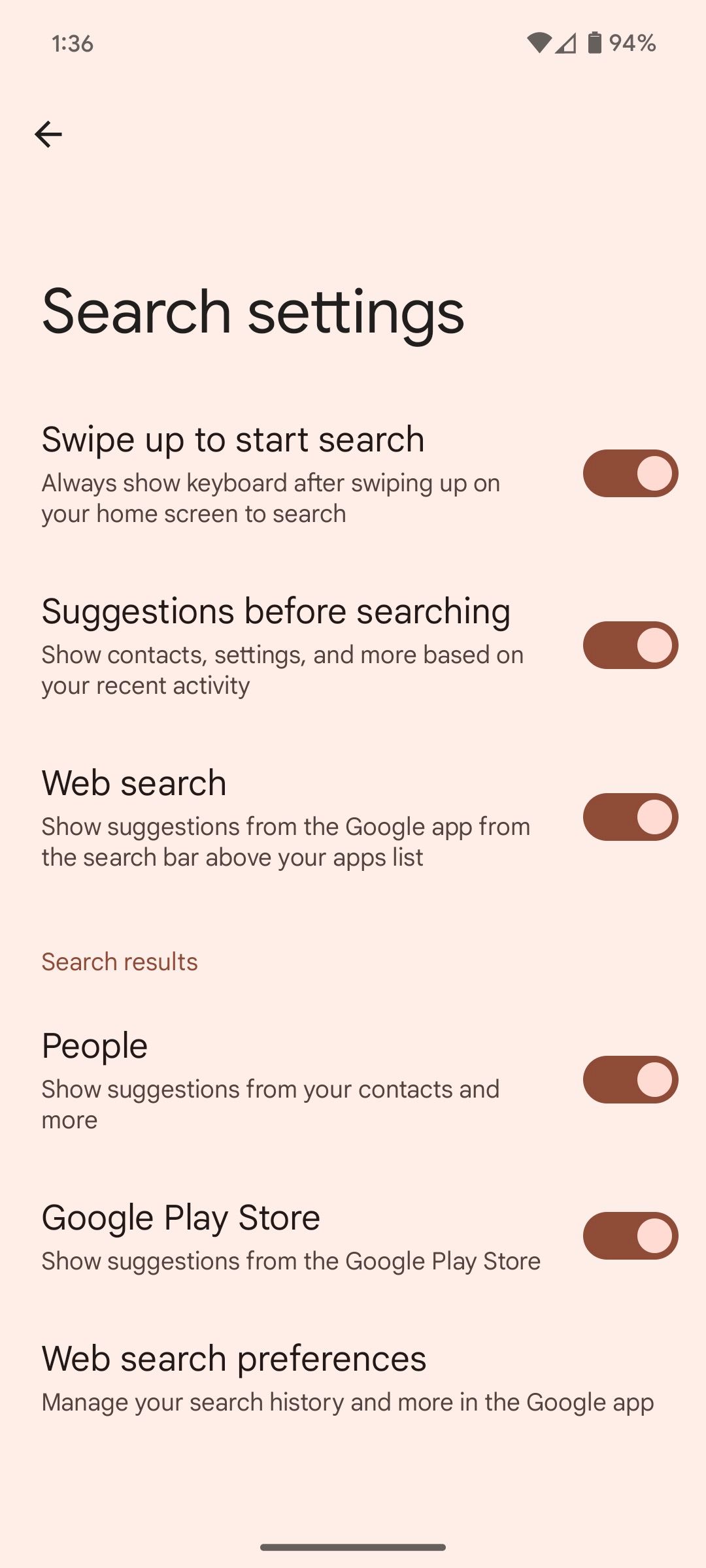
Pixel Launcher users can navigate to Home settings by long-pressing an empty area on their home screen and tapping Home settings from the onscreen popup. The new Apps list settings page is sandwiched between the Search settings option and the Allowhome screen rotation toggle. Interestingly, the new Apps list settings page also contains the Swipe up to start search toggle, which in Android 14 resides within Home settings > Search settings, as you can see above. It’s worth mentioning that we first spotted the new Apps list settings page last month, also thanks to Rahman’s input.
The results are quite impressive
For people whose app drawers are filled with longer-named apps, even shrinking down the app grid to 5×5 doesn’t help. With this in mind, a toggle to ensure the full app names are shown at all times within search results and the app drawer is a great addition. Of course, not everybody needs that extra line in their app drawer, as familiarity with icons is generally enough to identify an app, even if the names are shortened.
It’s currently unclear if Google plans to display app names in two lines within the home screen as well, but as it stands right now, this is only supported within the app drawer and search results. Google has been working on this feature since early 2022, as Rahman points out, so it’s been a long time coming.


