Tech
The Reddit app is giving comments some long-overdue attention

Summary
- New Reddit app updates aim to enhance user interaction with posts and comments, reducing loading time frustrations and improving navigation.
- Changes include quicker access to post comments, a consistent experience across all post types, and improvements to video and image content interaction.
- While some users may find the new features a bit confusing at first, they ultimately offer a slightly different but not deal-breaking mobile Reddit experience.
The mobile Reddit experience can be hit or miss. There are lots of annoying ads to deal with, the videos load slowly (if at all), and you tend to be bombarded with recommended communities. Given how much of a burden enjoying Reddit on iOS or Android can be, it’s good to hear that some new updates are coming to the app, particularly in terms of how users interact with posts and each other.
Best budget Android phones in 2024
These days, you don’t have to pay through the nose to get a decent phone
New changes incoming
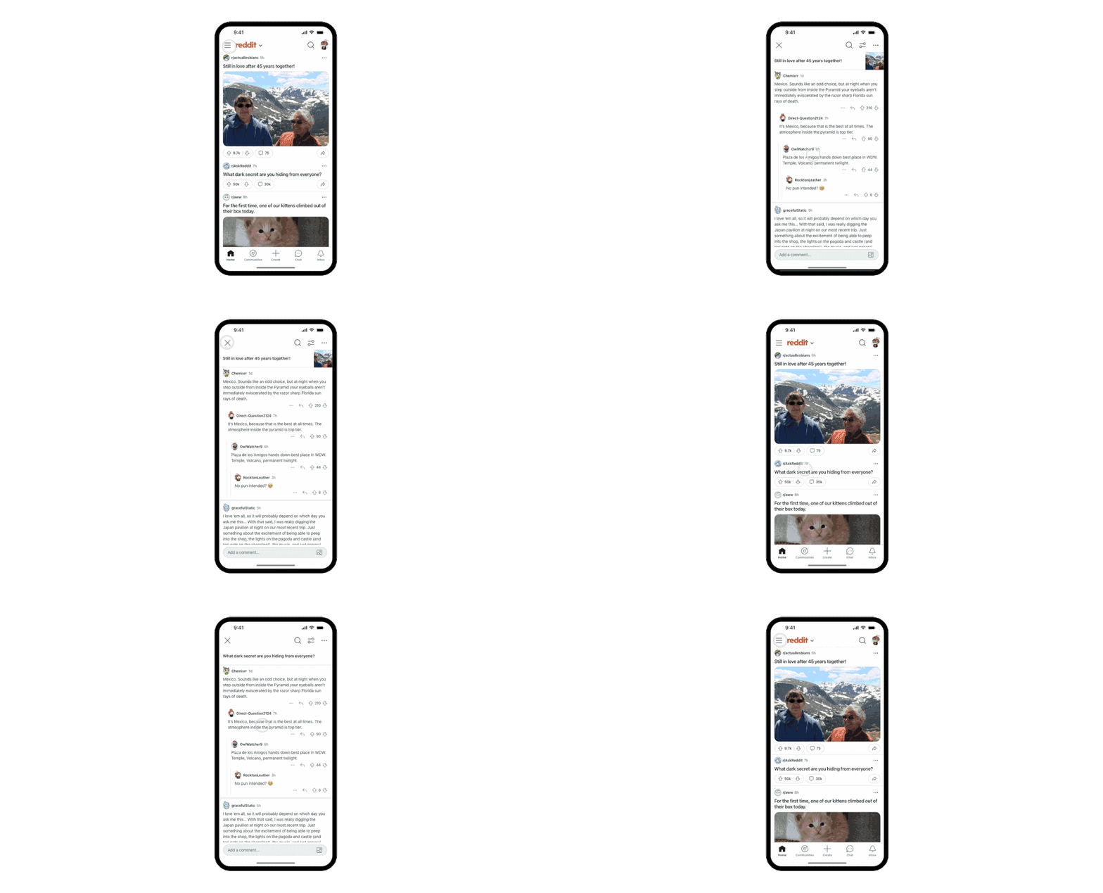
The look of the Reddit app isn’t going to change too much; most of the new updates will affect how users can interact with the UI, making it easier to create relevant content in the form of post comments. Reddit says it’s speeding up comment loading by beginning to load post comments before users interact with the post.
Users will also have two access points to posts. Tapping on the post title or its text content preview will take you to the top of the post, but tapping on the comment icon will now take you directly to the comments, that way you can leave your hot takes before you have time to figure out the full context, as is Reddit tradition.
Source: Reddit
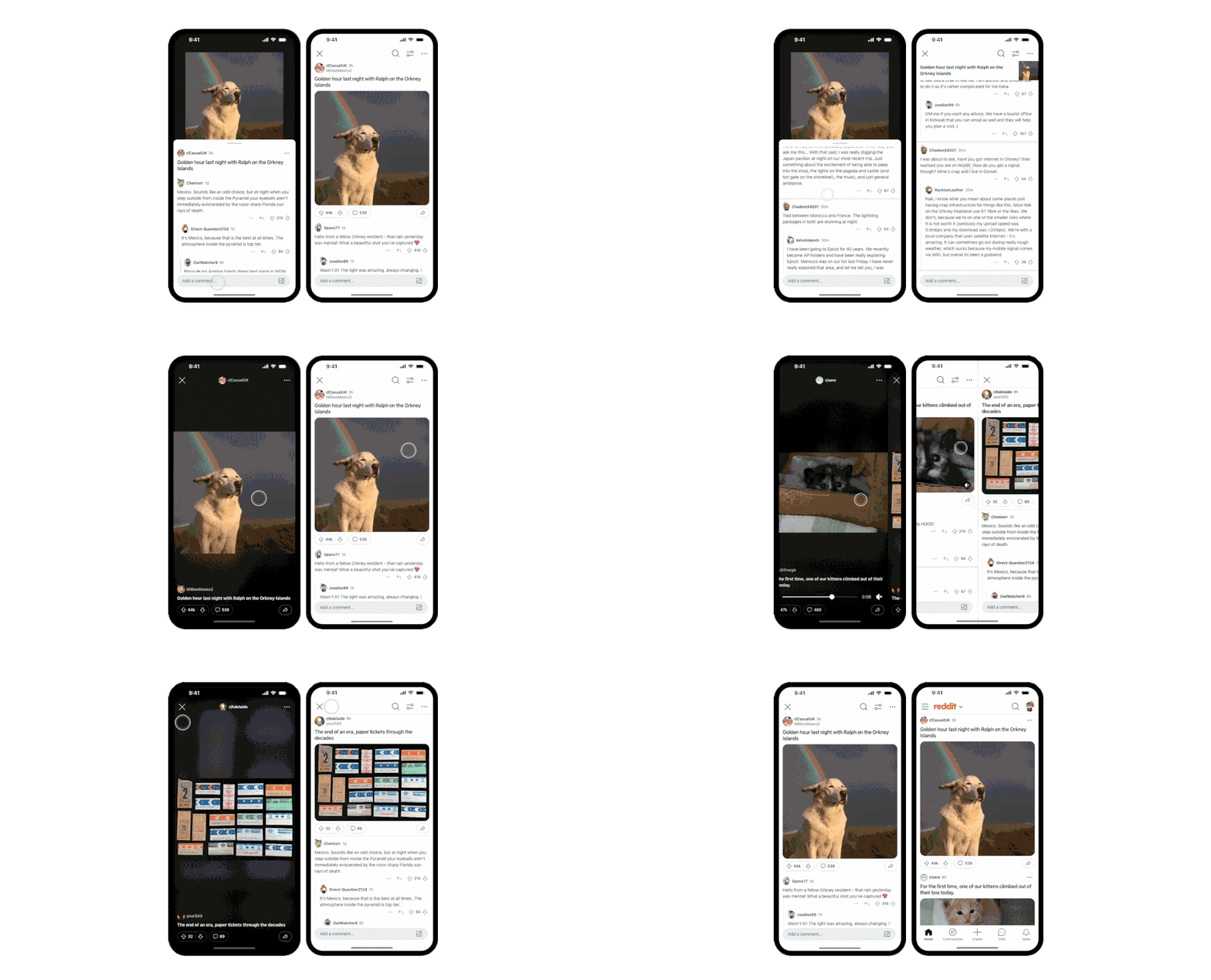
The last big update that Reddit’s touting is a consistent experience across all post types. That means swiping up will always lead you to the comments, no matter the post type, and swiping left will always lead you to new content.
A sneak peek of Reddit’s new features
What I like and what I don’t
I have a feeling I won the A/B-test lottery because I’ve had these new features on my phone for at least a week. One of the new features I like offers an easy way to jump back up to the original post via a sticky bar at the top of the screen. This is particularly nice to have when you find yourself deep in the comments and forget what the original post was even about.
Source: Reddit
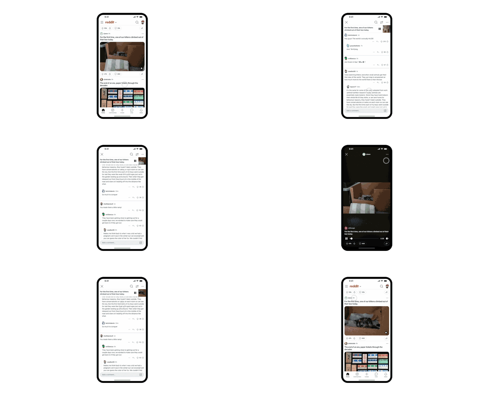
One of the biggest changes is in how users interact with videos. When viewing videos previously, users would swipe up to bring up the next video. With the new unified transitions and gestures, users will swipe left to load the next video in the queue. Swiping up will now take you to the comments for that video.
Interacting with image content works the same way the new video content works, which is more of a headache than the old UX. When tapping an image from a post, instead of jumping to the post, it’s treated like a video where swiping left will take you to more image content from the subreddit. It becomes a headache when you swipe up to access the comments, and the X in the top-left corner disappears, and the image floats at the top of the screen. To hide the image you have to swipe up on a little UI element just below the image. To return to your feed, you either have to tap the image again to reveal the X or you have to tap the back button twice. If you don’t want this new functionality, tap on the post title or the comment icon, not the image.
Source: Reddit
Some good, some bad
How to make a subreddit
A quick-start guide to creating a community on one of the most popular social media sites
After a week or so testing these changes, I can say that they aren’t all bad. I’m still getting used to the new ways of interacting with the app (remember, this is mobile exclusive), so I’m not sure Reddit met its goal of removing friction points from the UX rather than just introducing new ones. Still, none of these changes are deal-breakers from a UI perspective. It’s different, just not by much. But if these changes are enough to chase you away, take a look at these four alternatives to Reddit.

