Tech
There’s a new look on its way for Google Gemini

Calvin Wankhede / Android Authority
TL;DR
- Google Gemini beta testers are starting to get access to a clean new interface for Gemini’s home screen.
- The refresh hides your chat history one tap away.
- Gemini also gets a bit more personal, welcoming you by name, just like on the web.
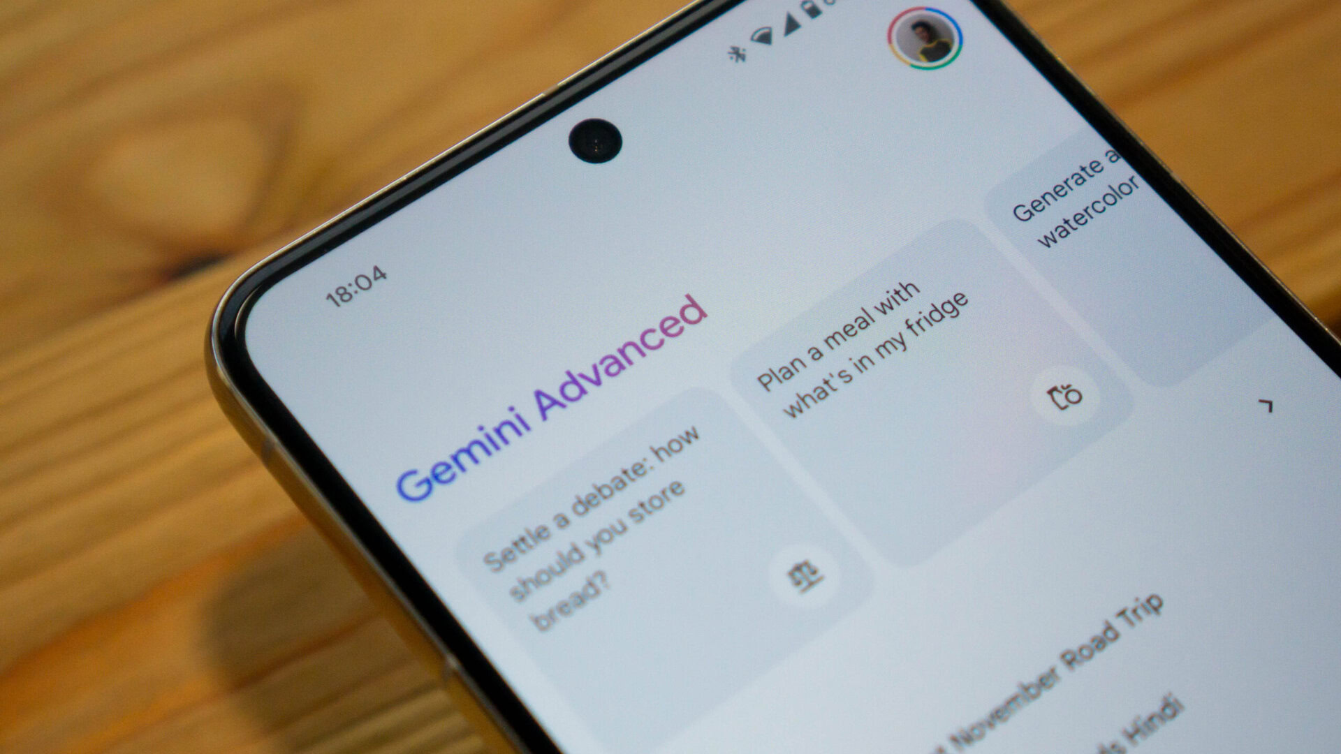
Google’s been hard at work over the past few months building its Gemini chatbot into a proper, full-featured evolution of Assistant. And while there’s still a lot of work to go there, Gemini’s already proven itself to be incredibly impressive, especially when it comes to advanced functionality like Gemini Live. Beyond just developing features, Google’s also been refining the way we access Gemini, and it looks like a fresh new look for the app is currently in testing for beta users.
We spotted these changes with version 15.38.46.29 beta of the Google app, and compared to the interface we’ve been using thus far, Gemini’s working to clean up its UI for a more clutter-free look. That involves dropping the suggestions up top, and hiding a lot of the rest of what we had behind the new icon in the top left. It’s there that you’ll tap to access your history of past chats. And below, Google’s giving us easy access to Gemini’s customizable Gems, for particularly tailored conversations with the chatbot.
The first sign of this new look arguably arrived via Gemini on the web, which features an interface largely similar to what the app’s experimenting with now — like the way the app personally addresses you to get started. We got our first peek at how this might look on Android just about a week back, and with access already available now to at least some users in beta, it doesn’t feel like it might be a huge wait longer before the same changes come to the stable build.
None of this is going to really impact our day-to-day usage of Gemini, but it still feels like a positive change, all the same — like Google trying a little less hard to “sell” us all on Gemini, and moving the app forward to a slightly more mature phase, with its interface focused less on discovery and more on usability.


