Tech
WhatsApp’s redesigned Status tray could be here to stay
Summary
- The latest WhatsApp beta for Android reintroduces a redesigned Status tray for previewing updates from contacts.
- This status update preview feature first appeared back in February 2024.
- Despite the obvious advantages of update previews, it takes up space from the list of Channels, which sits directly below the Status tray.
WhatsApp is easily one of the most widely used messaging apps, with millions of daily users. In addition to maintaining the app’s day-to-day operations, developers are also tasked with making necessary UI adjustments to keep things fresh. Back in February, a WhatsApp beta release showed us a redesigned Status tray inside the Updates tab, offering a small preview of the update. The Meta-owned app is now rolling out this updated preview-focused Status section to more beta testers on Android.
11 best features WhatsApp added in April 2024
Practical progression and visual verve, we saw it all
This redesign has reappeared in version 2.24.10.10 of WhatsApp beta for Android, though I didn’t have any luck replicating the experience despite sideloading this particular version of the app. In the meantime, WABetaInfo says the update should reach more WhatsApp beta testers in the next few weeks.
This suggests that the redesign is still some distance away from making the jump to the stable channel. Nevertheless, the fact that this redesigned Status tray has made two separate appearances indicates that it’s here to stay. However, it will be interesting to see how WhatsApp will counter criticism of this particular redesign.
It takes up too much space
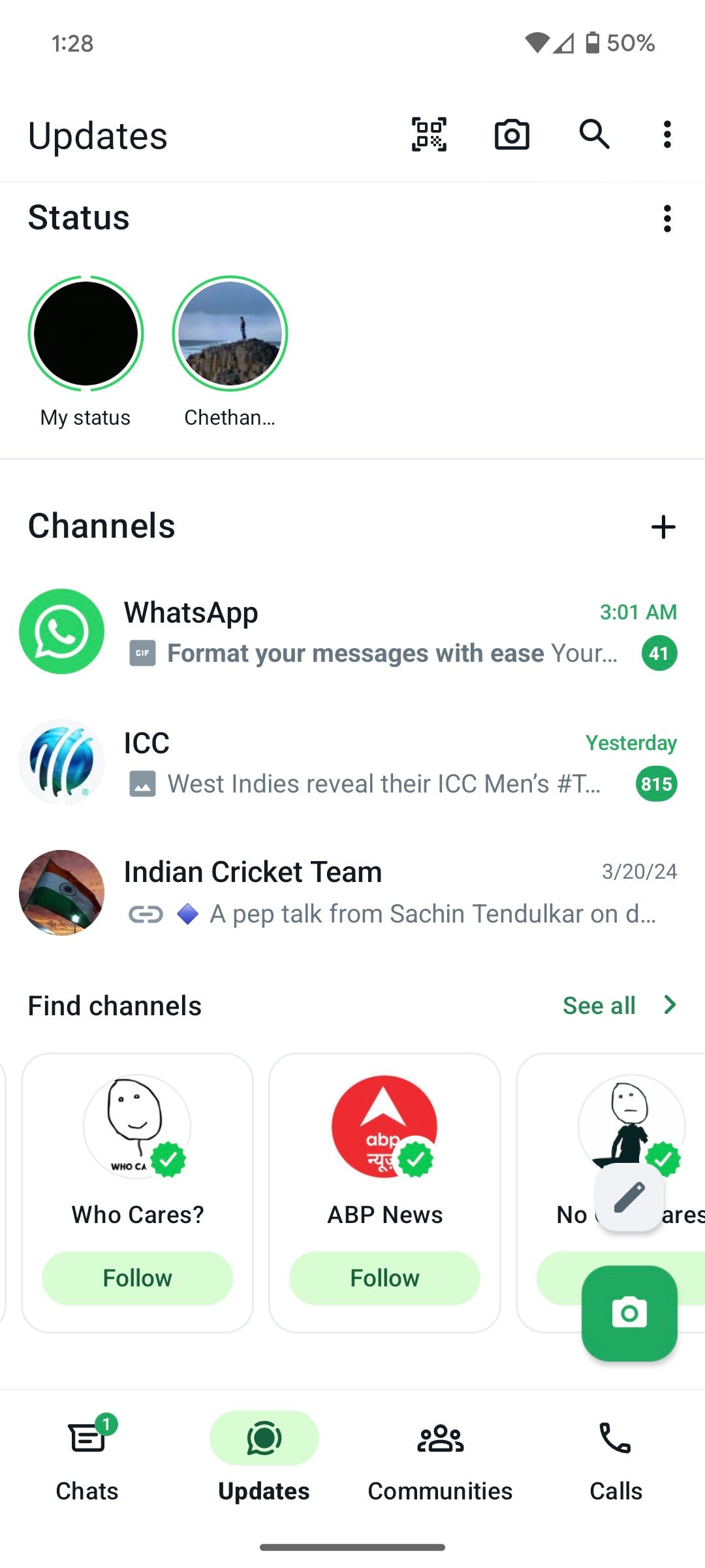
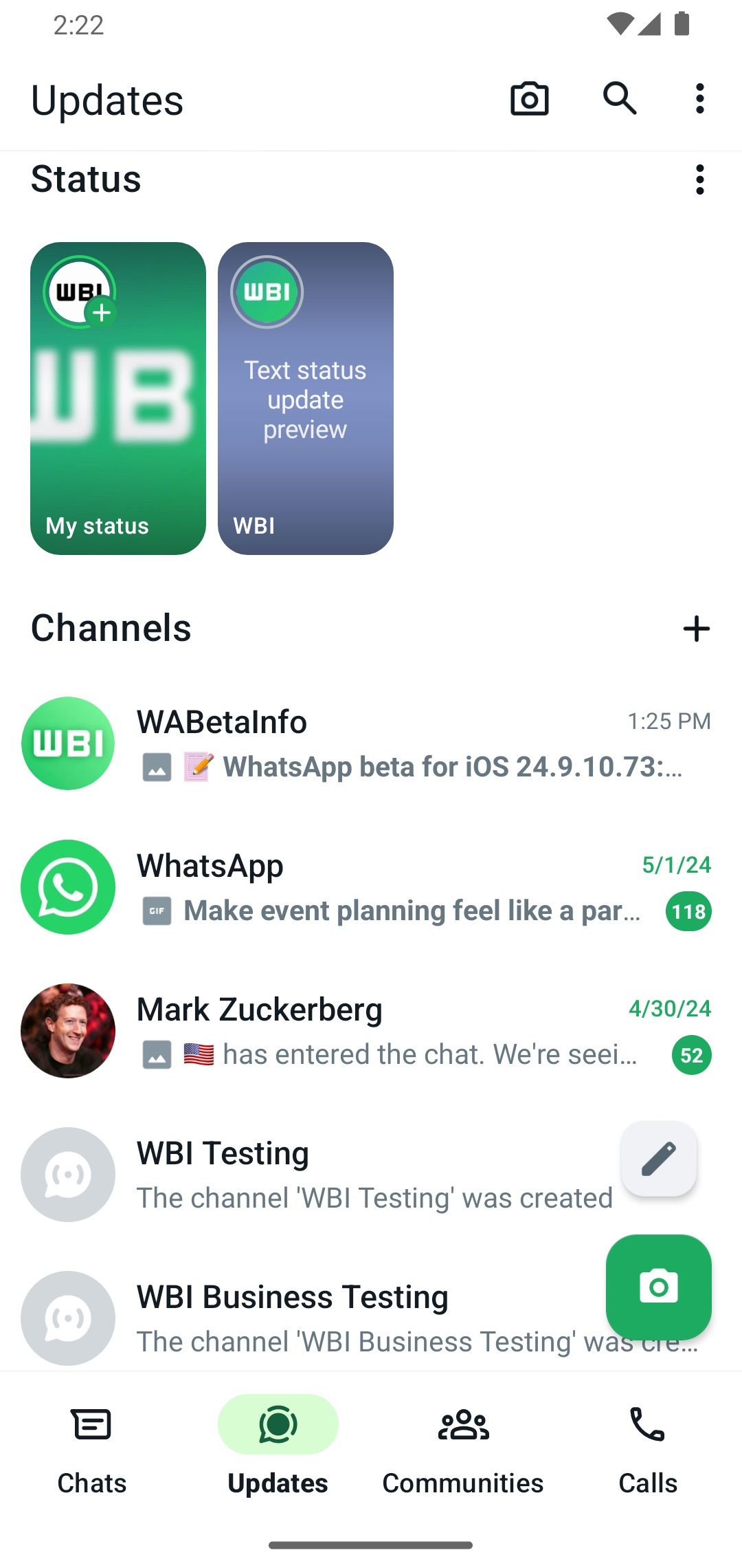
Current WhatsApp Status tray vs the redesigned version
As we pointed out while covering the Status preview’s first appearance in February, there’s the obvious advantage of letting users choose which updates they want to view in the Status tray. Frequent WhatsApp users know that not all status updates deserve our attention. So to get a decent preview before viewing an update makes a great deal of sense.
However, on the downside, providing a mini-preview of your contacts’ status updates also eats into the space of Channel subscriptions, as evidenced by the second image above. So WhatsApp has to consider whether status updates are more important than the Channels that users have subscribed to. While it’s definitely a step up from the current Status tray, which requires users to tap each update to view what’s posted, there’s an argument to be made against shrinking the available space in the already crowded Updates tab.


